Sunday Health Co.
Summary
Sunday Health Co. specializes in FQHC consulting firm. The industry focuses on providing health care to low-income communities and reducing health disparities. The health centers are often a hub in their communities and provide not only health care but social services, food pantries, and help with accessing programs for housing, childcare, etc.
One of the primary goals of the Sunday Health Co. branding will be to communicate trustworthiness and competency, but also to have a fresher, friendlier, more modern approach to the industry than most competitors.
**The taglines are placeholder info and can be updated in revision rounds.
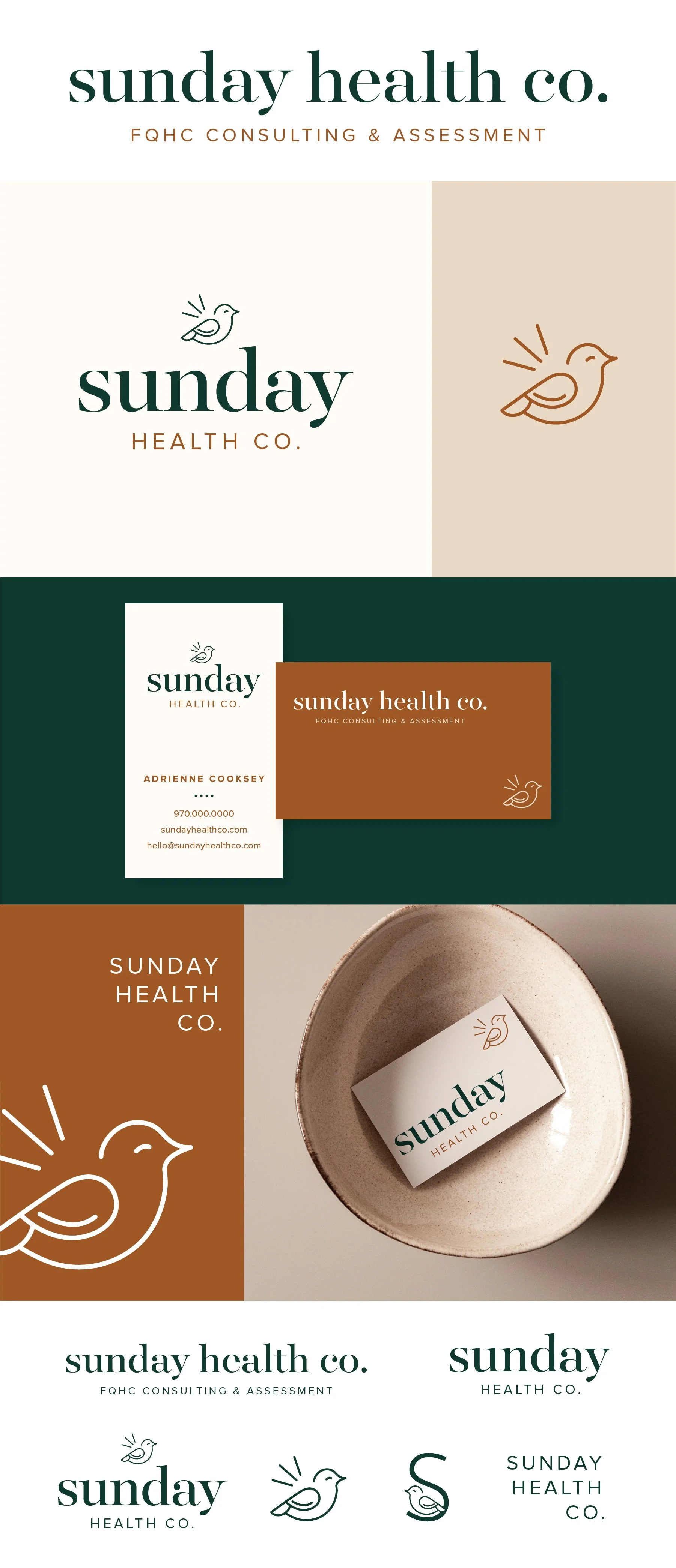
Below each of the three concepts shows the
Primary, Horizontal Logo
Vertical Logo
Initial/Logo Mark
Business Card Mockup
Alternate Branding Elements
Print Piece Mockup
Logo Suite
Note
While each of these designs are meant to show a developed idea of each concept, each will be refined and the chosen concept will be carefully considered and added to until the brand is the strongest representation it can be.
Business card concepts and the homepage mockup are meant to show how the brand can progress beyond the logo alone and will be refined along with the logo. Additionally, the information shown is placeholder information.
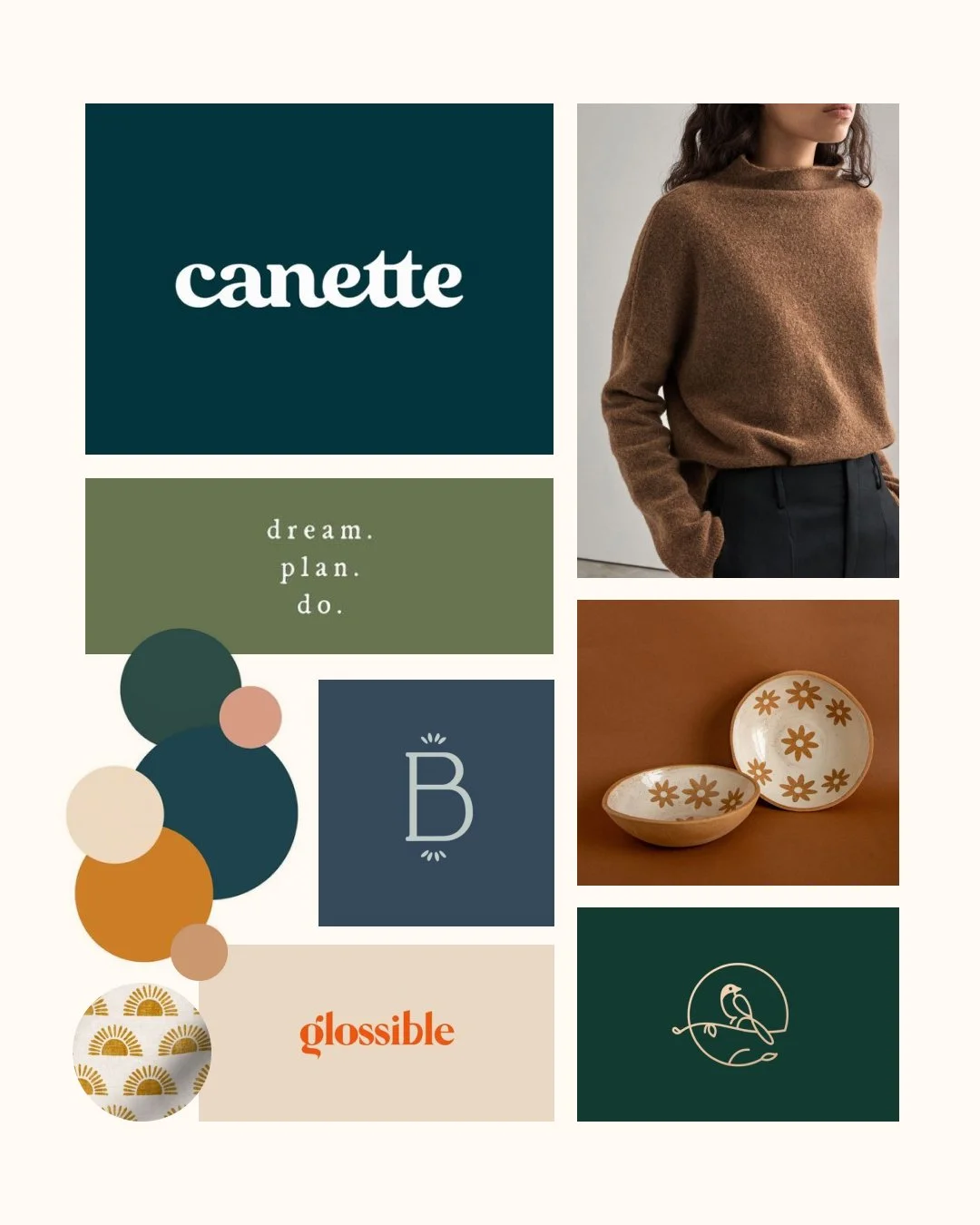
Moodboard
Brand Tone
Community Minded
Modern
Happy
Professional
Upbeat
Organic
Initial Concepts
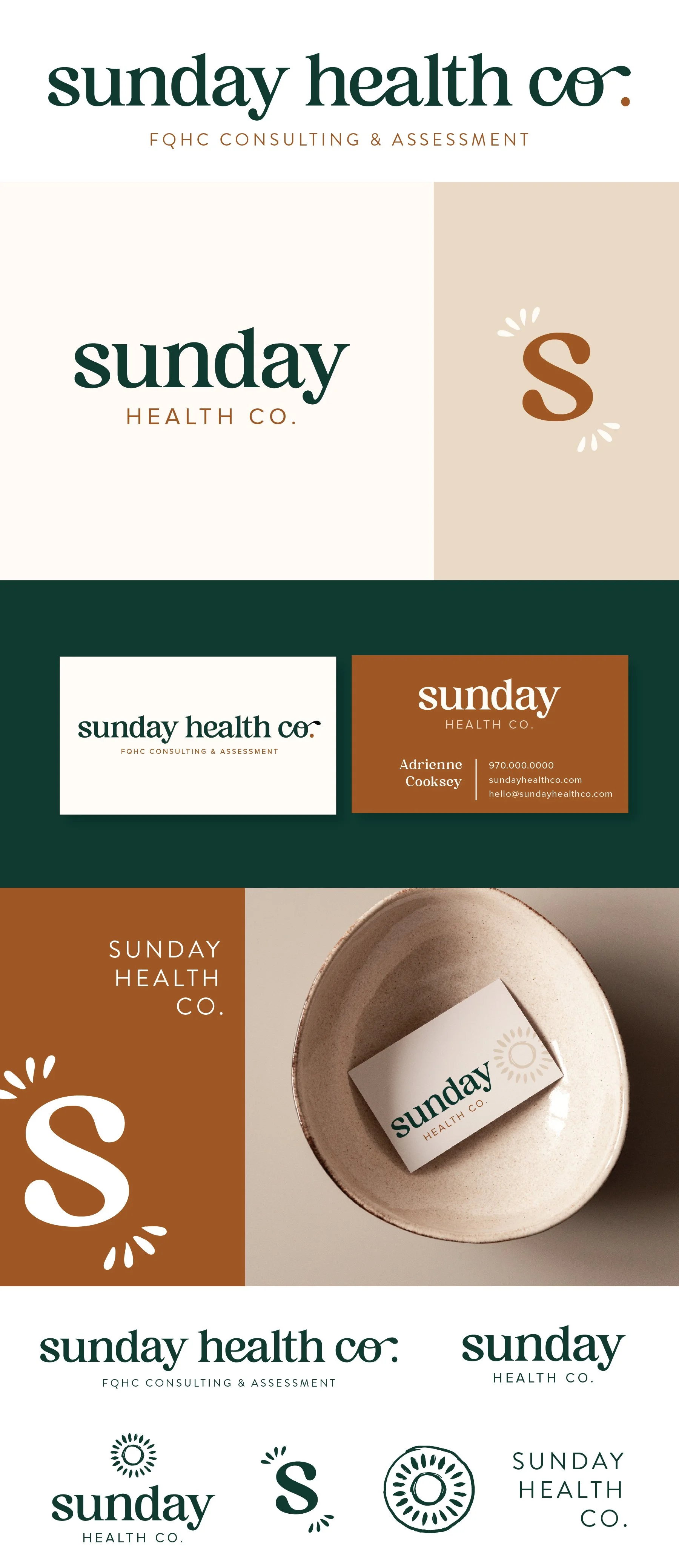
Concept 1
Key Words: playful, inviting, upbeat, modern-retro, positive
This option is playful and fun! It maintains full legibility and professionalism, but it definitely positions itself as an all-around happy and positive personality. The customization in the letters adds to the playful personality, as do the playful accent marks around the S initial mark.
I really played up the Sun part of Sunday and let that also harness a really positive, sunny style all in all. I think the combination of all the elements really communicates being a positive force.
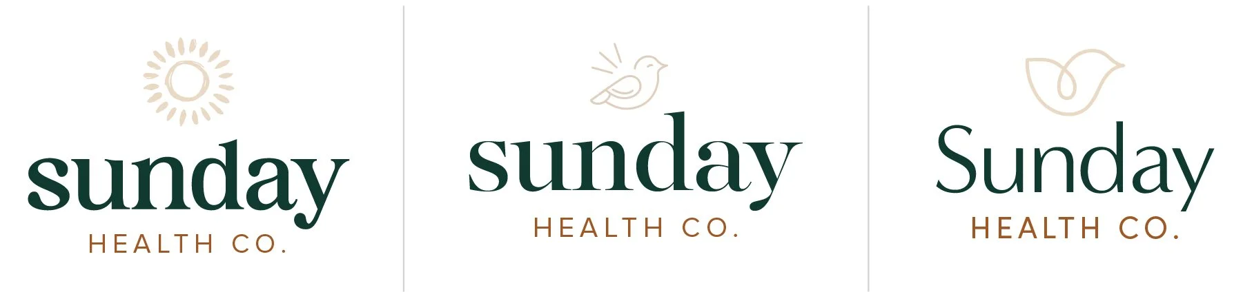
Concept 2
Keywords: polished, timeless, hopeful, positive
This option is really versatile and still communicates all the core values of the company. The font is still warm and inviting, but a little more refined than option 1. The lowercase in Option 1 & 2 make the style less formal and friendlier.
I thought a bird was a great option for you. When I looked up the symbolism for a sparrow the results were: joy, community, teamwork, protection, simplicity, hard work, or self-worth. I thought that was SUCH a perfect fit for your audience and for mission-driven work. I wanted the bird to have a peaceful and positive look. I also included the little emphasis lines, because I think that is an element that can be used in the branding separate from the bird and also implies action.
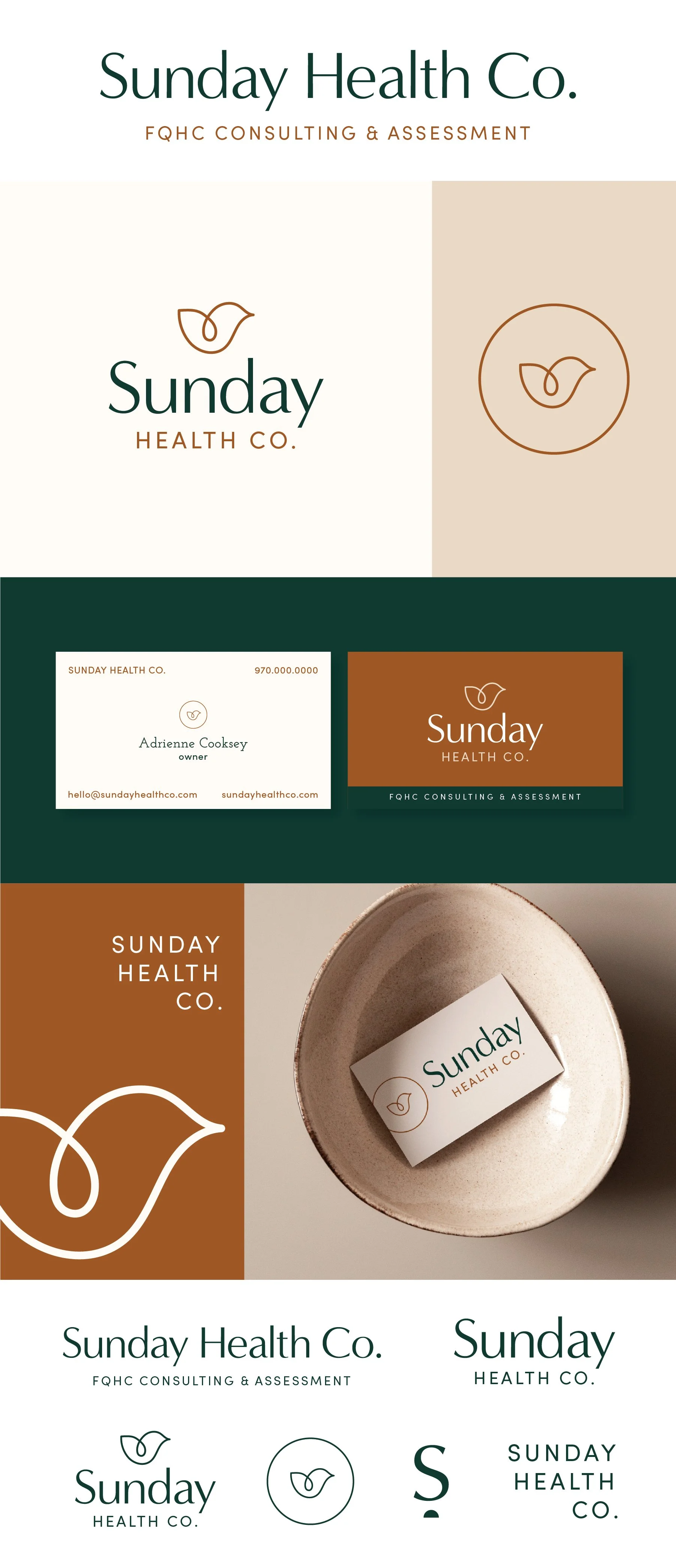
Concept 3
Keywords: Softer, timeless, professional, clean, and modern
What I like about this version is the softness combined with the timelessness. The bird has a slight shape of a heart without overdoing it, but I think it lends itself well to mission-driven work without feeling cheesy. The simplicity makes it really versatile in scale and shape. Simplified icons like this bird are a closer fit to what some health-related companies tend to do, so it could work well for familiarity within the space.