Saint & Company
Summary
Saint & Co. specializes in hand drawn and painted art. Specialty products currently include custom home or building portraits, prints, and temporary tattoos. The rebrand was prompted by a name change as well as a forward thinking move to create a brand that will be able to grow with the company as product lines are expanded.
Below each of the three concepts shows the
Primary Logo
Tattoo Packaging Mockup & Secondary Logo
Tagline Treatment
Homepage Mockup
Business Card Design, Photo Overlay, Pattern
Packaging Mockup
Full Logo Suite
Note
While each of these designs are meant to show a developed idea of each concept, each will be refined and the chosen concept will be carefully considered and added to until the brand is the strongest representation it can be.
Business card concepts and each of the mockups are meant to show how the brand can progress beyond the logo alone and will be refined along with the logo. Additionally, the information shown is placeholder information.
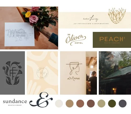
Moodboard
clean, hand-drawn, sentimental, Lighthearted, meaningful, high-detail, but simple
architectural, floral, realistic, affordable, family-oriented, cozy
Initial Concepts
Concept 1
Key descriptors: timeless, classic, nostalgic, heirloom
The concept brings together all of the “highlights” of your brand. The primary logos have a classic look while the sketches and the stylized ampersand bring in the hand-drawn aspect. I think this strikes a really nice balance that brings together the “nature of opposites” in your brand. like architecture and florals, hand-drawn and realistic.
The two primary illustrations also represent opposites with the daisy symbolizing purity, innocence, and love while the protea symbolizes strength and courage. This illustration style also easily lends itself to you being able to easily incorporate your own drawings if you want to expand on the icons in the future.
Concept 2
Key descriptors: modern, a touch of bohemian, a flair of funky
This concept has a light-hearted, fun, easy flair to it. The icons are a little more sketchy and less detailed. the logo font has some fun, artistic characteristics, and the script font incorporates really easily.
I would say that this concept takes the overall tone into a more bohemian, artsy realm. It’s sophisticated but not overly serious.
Concept 3
Key descriptors: sketchy, hand-drawn, playful
I would say this concept leans most heavily into the hand-drawn feeling. The ampersand in particular has a lot of character and narrative. It feels very customized to you and lends itself to interpretation if you look for the “S” or “&” with the shape. This concept also has the most script text includes which brings in fun energy.
The illustrations themselves are a lot more abstract. They work well as a pattern as well as being able to mix and match some of the illustration elements. All in all, this is much more playful and explores more styles in the brand elements.


