Meso RNA
Summary:
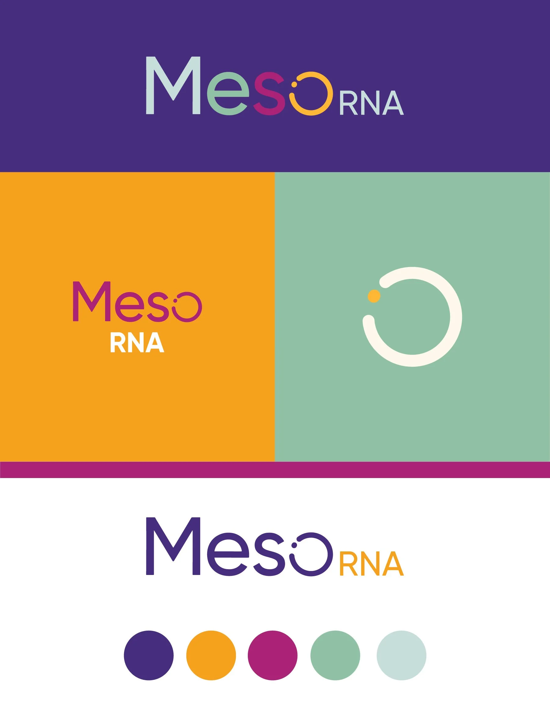
Each concept focuses on incorporating a focal point in one of the letters in the name to make a subtle statement. I kept coming back to the idea that your research is centered around something that was always there but hasn’t been explored. so I liked the idea of using the letterforms already in your name with an intriguing detail.
The design direction of all four concepts uses a fresh, intriguing, and innovative color palette. There are varying uses of gradients in the concepts below, any of which could be applied to your chosen concept if you like the incorporation of a gradient.
Below each of the three concepts shows the
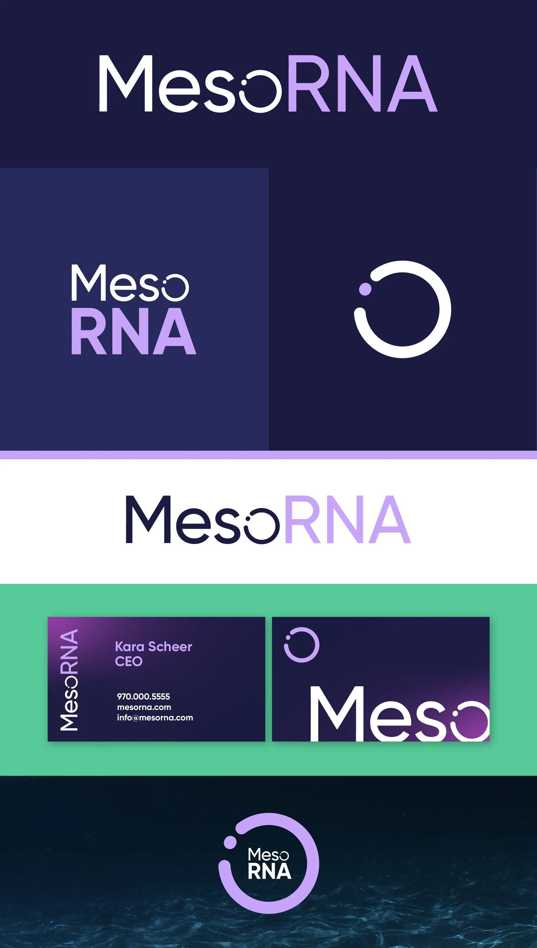
Horizontal Logo
Vertical Logo
Logo Mark
Horizontal Logo on a light background
Business Card Mockup
Condensed Logo
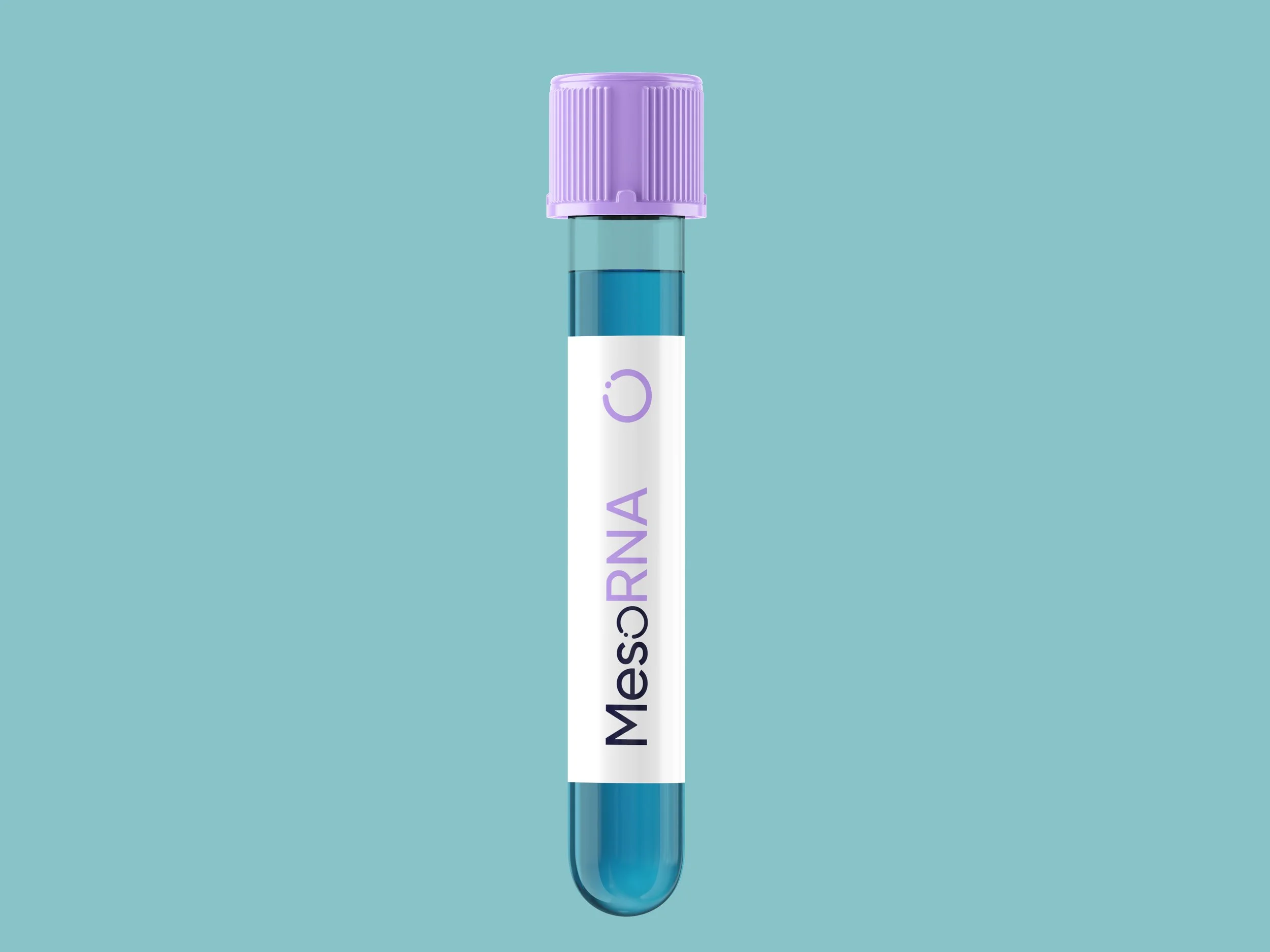
Test tube Mockup
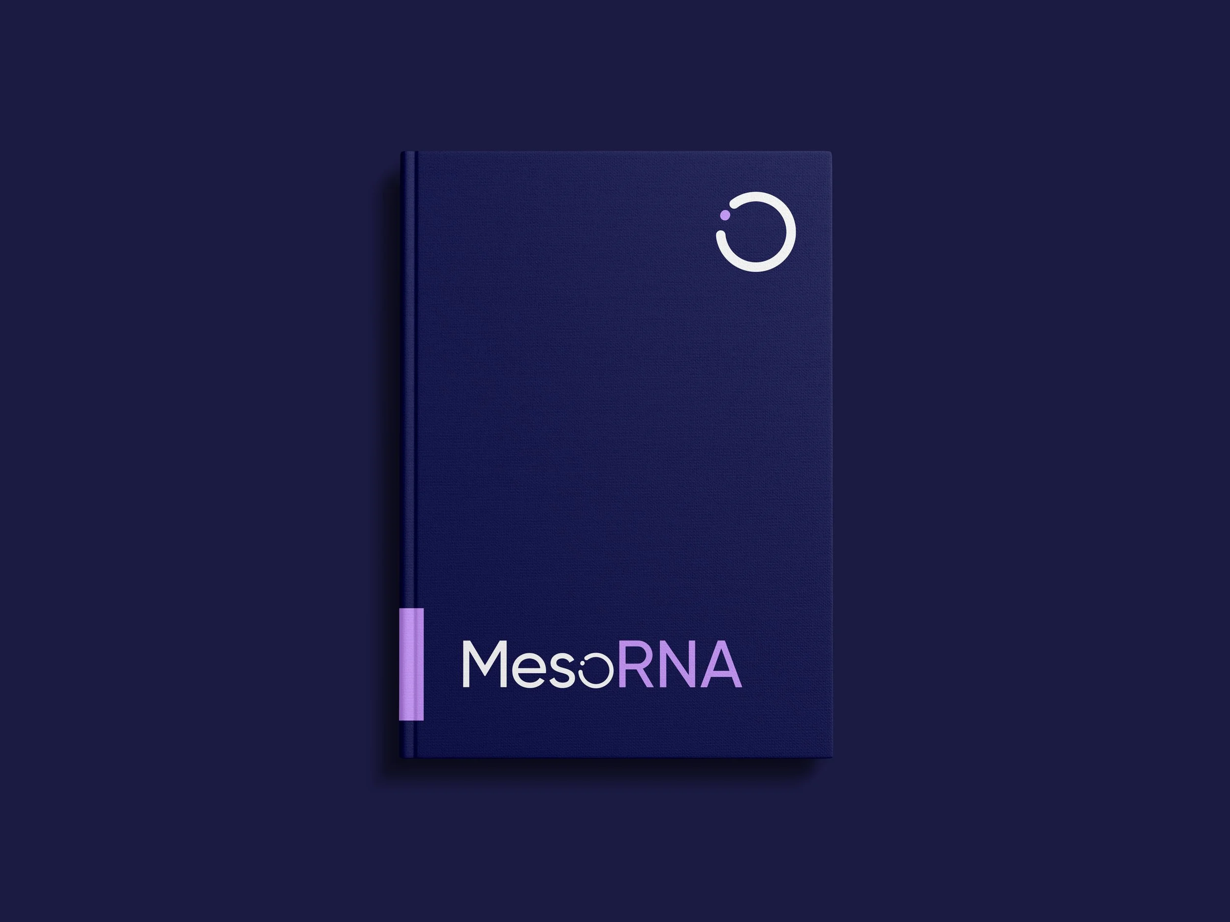
Notebook Mockup
Note
While each of these designs are meant to show a developed idea of each concept, each will be refined and the chosen concept will be carefully considered and added to until the brand is the strongest representation it can be.
Business card concepts and the homepage mockup are meant to show how the brand can progress beyond the logo alone and will be refined along with the logo. Additionally, the information shown is placeholder information.
**The taglines are placeholder info and can be updated in revision rounds.
Moodboard
Revisions
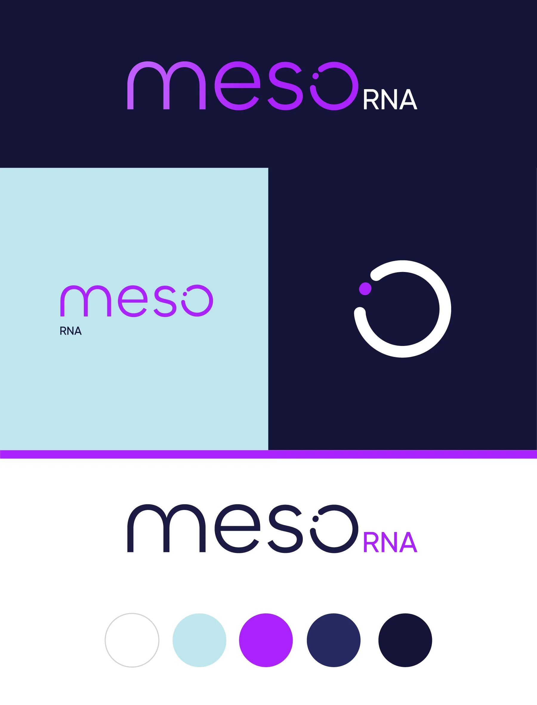
Color Palette 1 - Energizing
Electric Purple / Midnight Blue / White
Accent Color: Light Blue
Note on the accent color: This is really just to provide a more “neutral” light shade in the brand color palette. I often find in useful for the website and/or marketing materials, but don’t imagine this as one of the main brand colors.
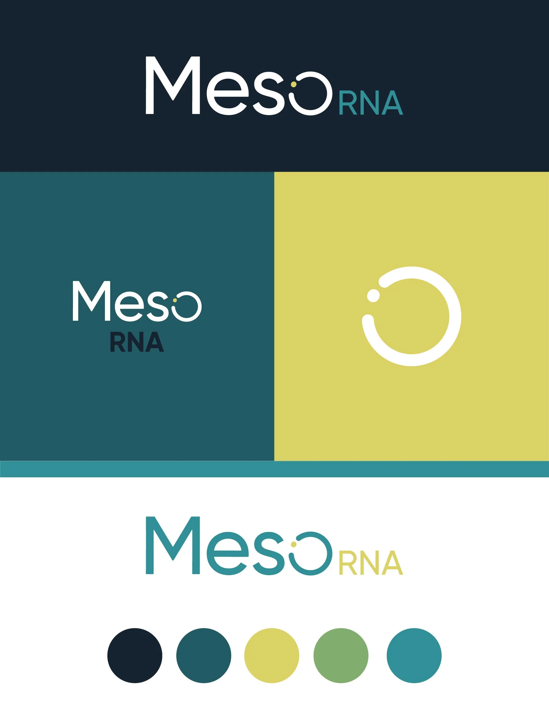
Color Palette 2 - Cool Tones
Teal / Midnight Blue / White / Citron
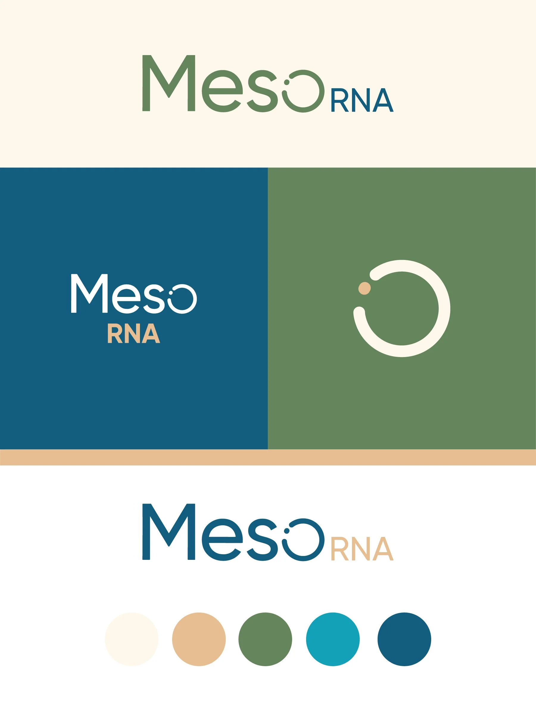
Color Palette 3 - Earthy
Moss / Teal / Neutrals
Color Palette 4 - Playful
Multi-Colored
Initial Concepts
Concept 1
The key idea behind this concept is to focus attention on a smaller piece of a larger whole. The smaller part is the piece that makes it whole, but by singling it out, it’s explored in a new way. The stylized "o” in this concept is meant to imply zooming in and invite you to take a closer look at the details, similar to the approach of RNA research.
This mark is also very versatile and will work well in any of the brand colors and and at any scale.
Concept 2
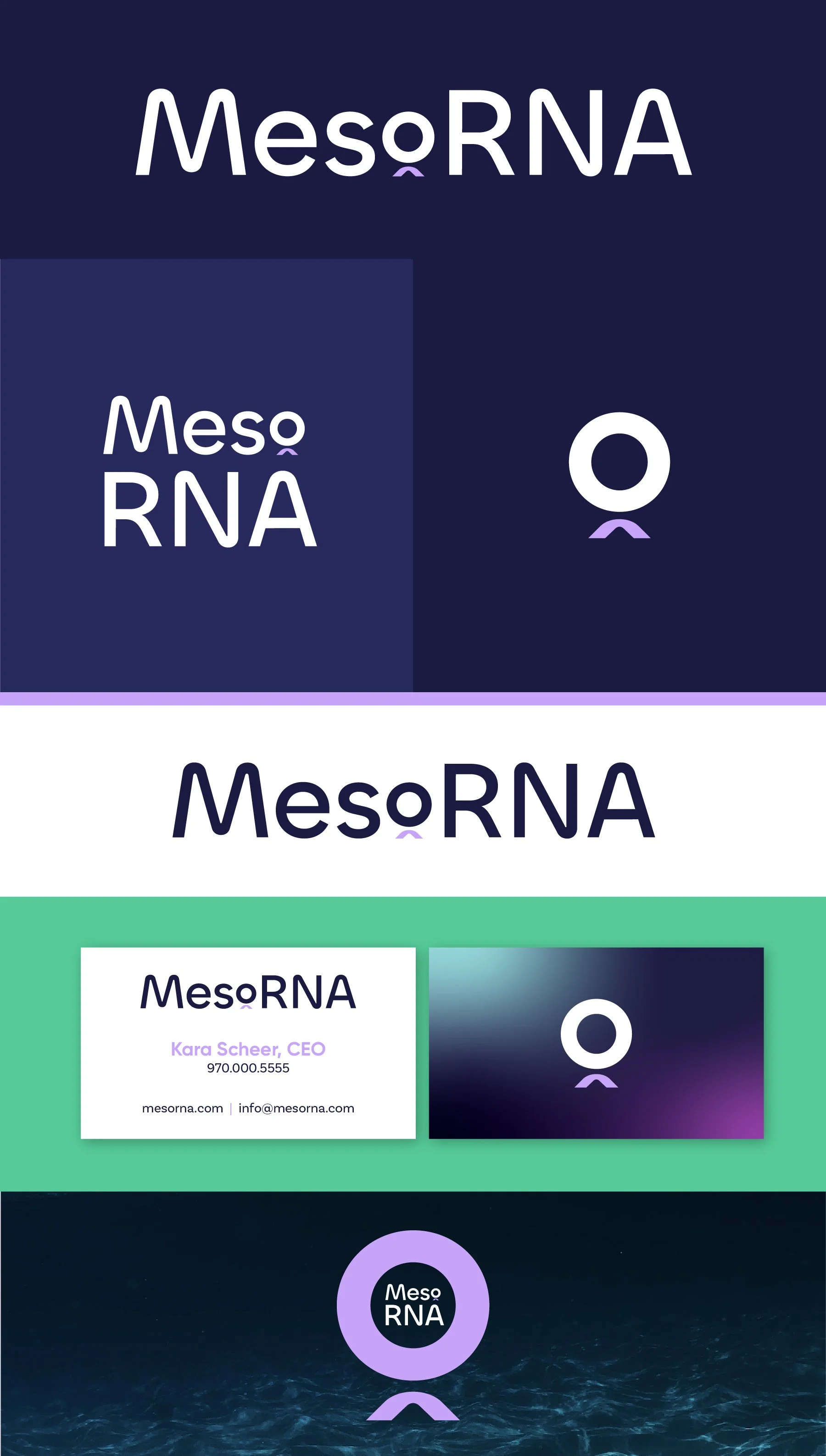
The thought process for this concept is similar to Concept 1 but with a different approach. The combination of the “o” and the small, subtle arrow is meant to make a more direct reference to shining a spotlight and tuning attention to a specific focal point. This mark also works really well on its own as well as at small and large scales.
Concept 3
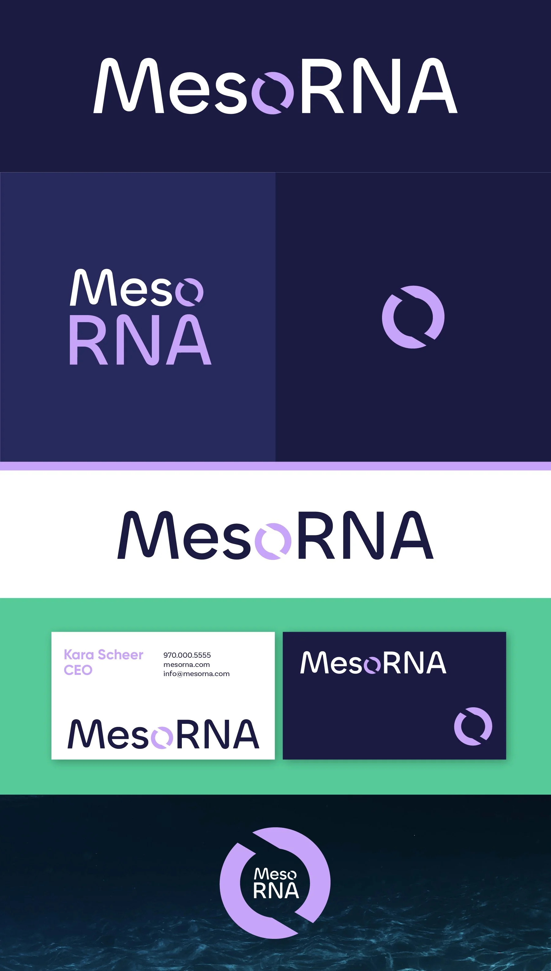
For this concept, I wanted to use something that still worked with the idea of a missing piece or filling in the gaps, but this version has movement implied in the shape of the “o”. This could reference that messenger RNA is dynamic but also implies the idea of momentum and being at the beginning of a “new frontier of exploration”.
Concept 4
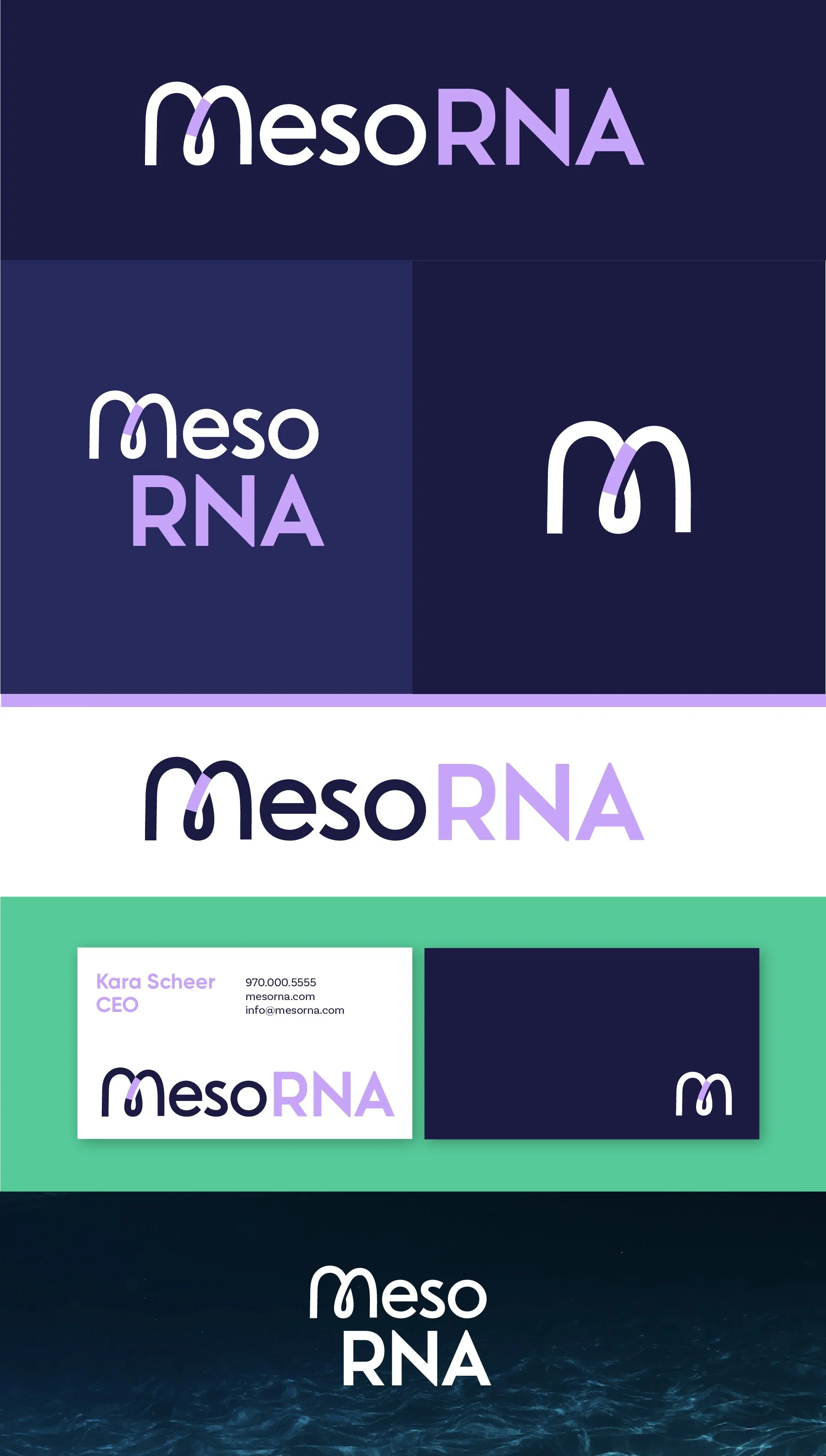
This concept provides some variety by having the focal point be in the M, and the style would be distinct in the industry.
This idea is similar to the others in that it has a puzzle piece that completes the whole. But it also creates a bridge between the two halves of the letter M, symbolizing how your research and your product can be a bridge to more knowledge, more solutions, and a new frontier.

