Elevated Concrete Coatings
Summary
Elevated Concrete Flooring is based in Fort Collins and greater Northern Colorado. They are currently known for quality residential coated garage floors. As they grow, their services will most likely expand to concrete work and commercial flooring, so their brand needs to be able to evolve with them.
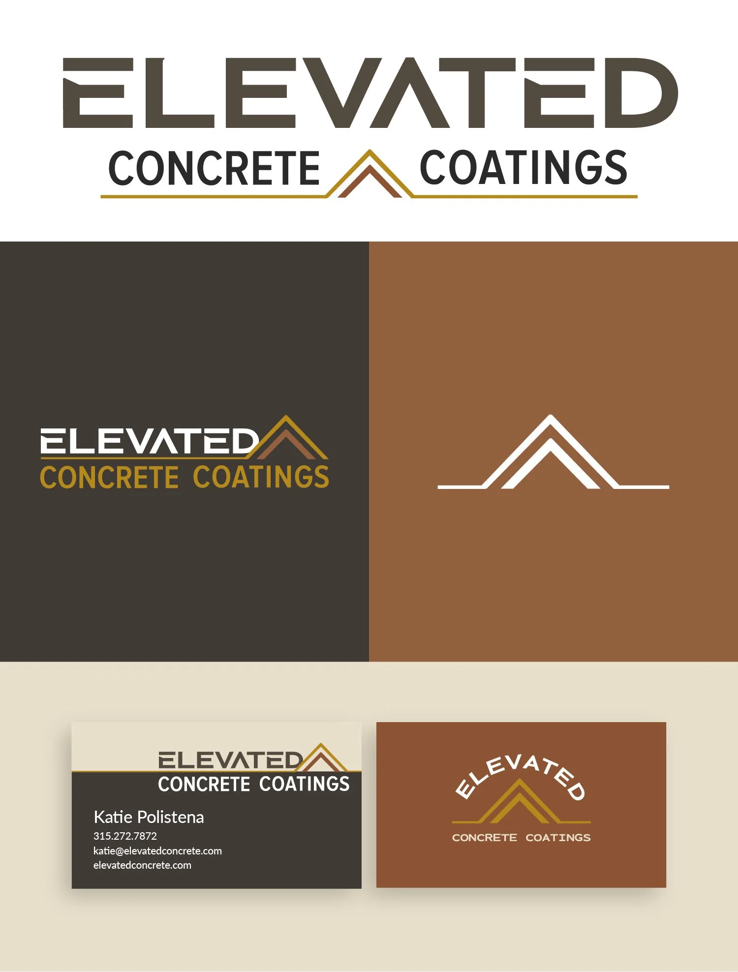
Reasons for their rebrand included having a logo that will function well in one color and to have something that speaks more to the services they provide. The existing branding is pretty but doesn’t relate to their services and isn’t custom to their business and will therefore not help them stand out and make an impression in their market.
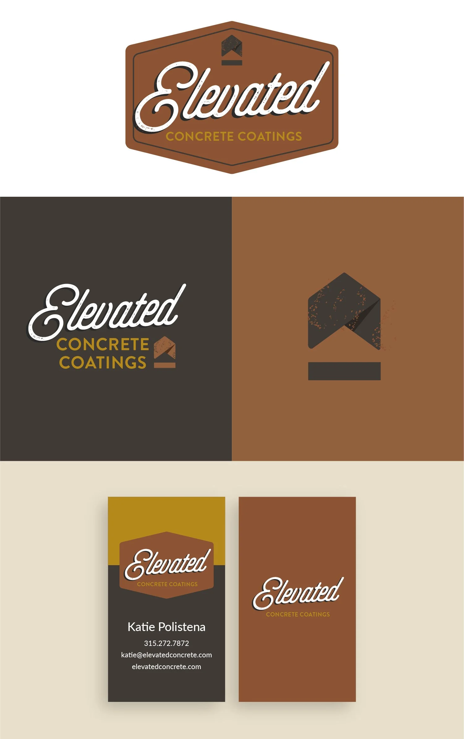
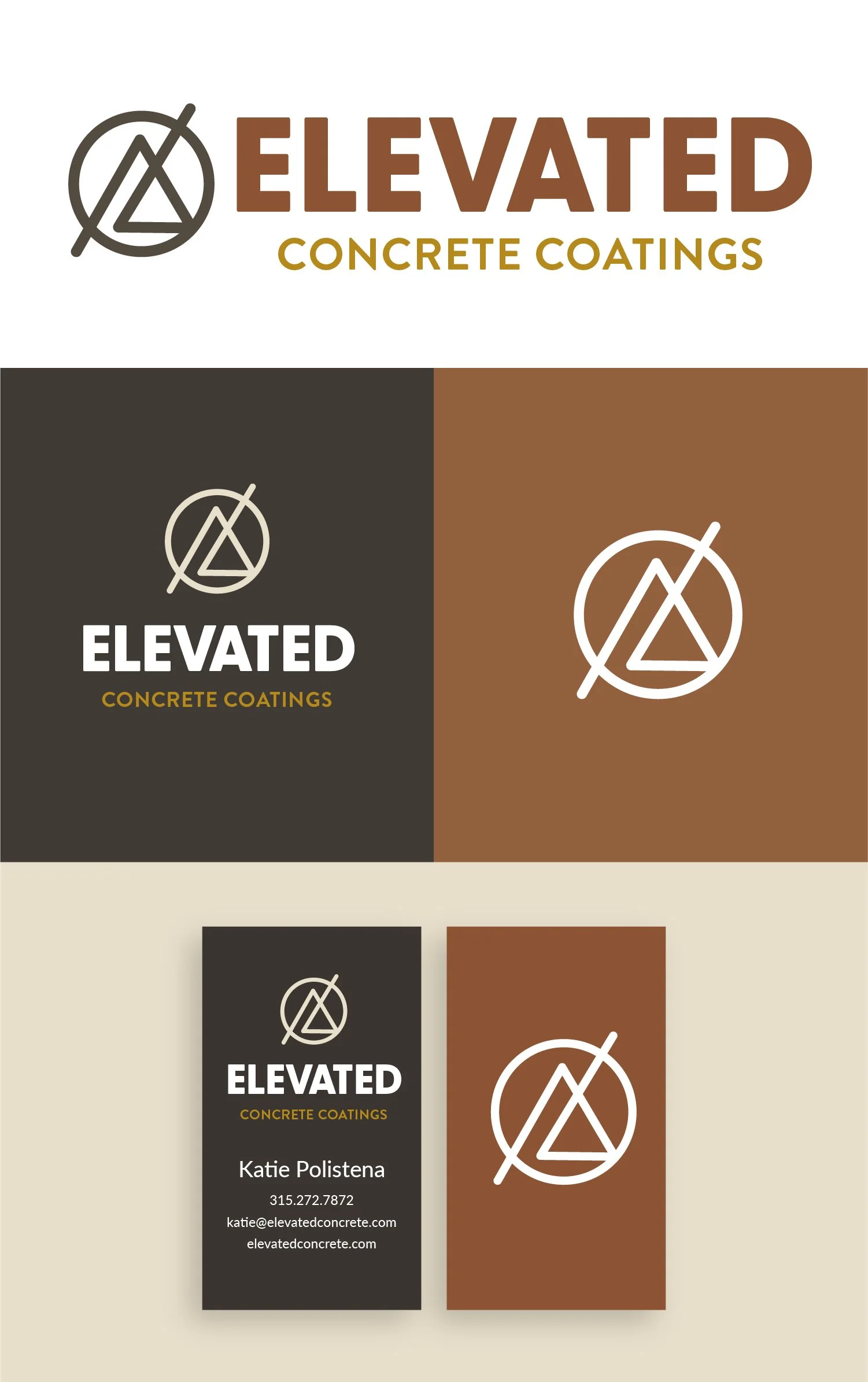
Below each of the three concepts shows the
Primary Logo
Secondary Logo/Logo Mark
Logo Variations
Business Card Design
Note
While each of these designs are meant to show a developed idea of each concept, each will be refined and the chosen concept will be carefully considered and added to until the brand is the strongest representation it can be.
Business card concepts are meant to show how the brand can progress beyond the logo alone and will be refined along with the logo. Additionally, the information shown is placeholder information.
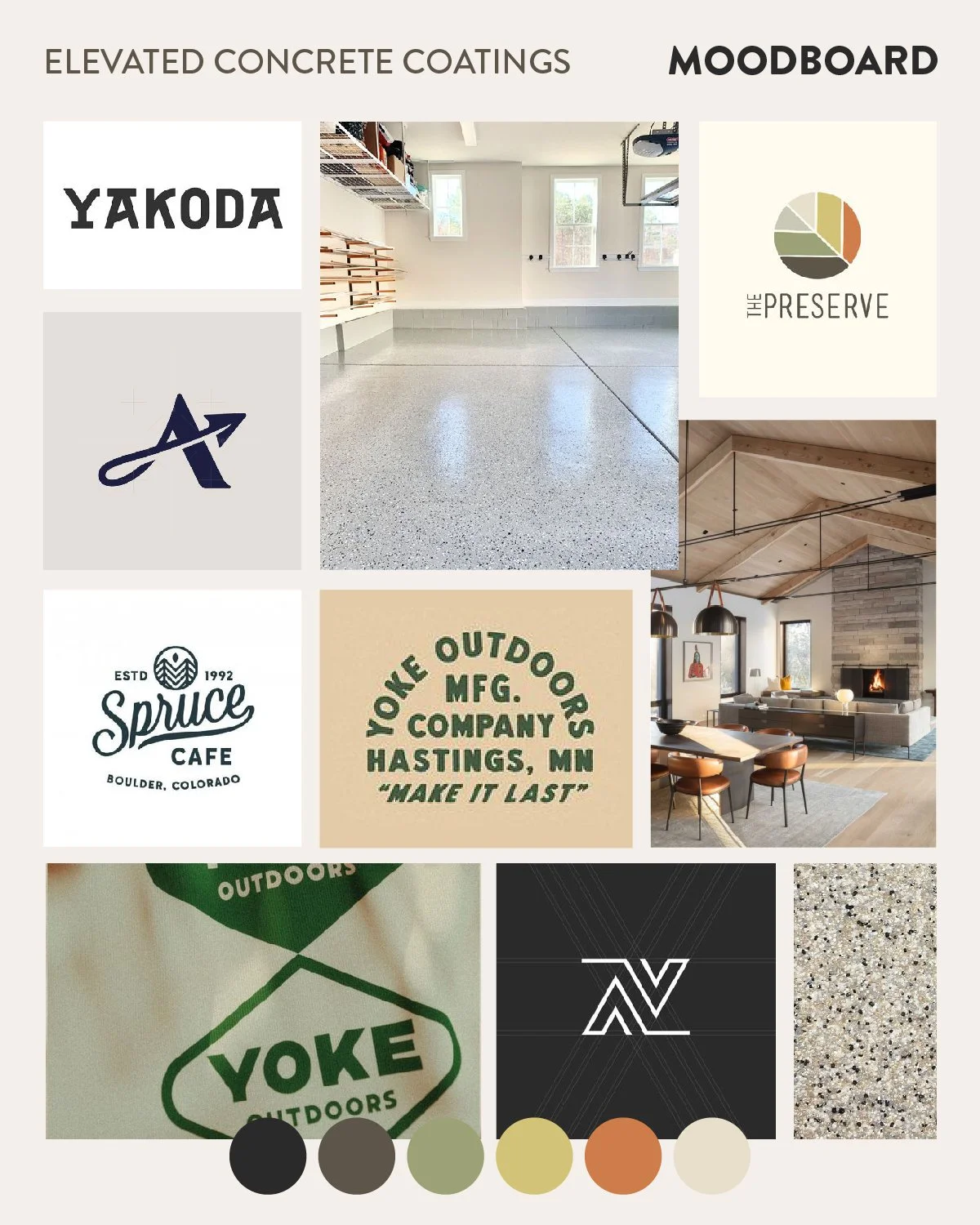
Moodboard
Caring, ambitious, faithful,
thoughtful, respectful,
professional, gifted, meticulous
Initial Concepts
Concept 1
Key Features and Qualities:
Really fun, welcoming overall tone
The retro style stands out from your competition well.
The logo text has versatile applications and can be used inside the shape shown at the top or without (like on the back of the business card.)
The logo mark works best in two colors, but when it is used in one color, it can have the darker accent removed.
I think the logo mark does a good job of harnessing the idea of elevation but it also references flooring with the horizontal bar below the arrow.
Concept 2
Key Features and Qualities:
Bold font with broad appeal - doesn’t feel overly masculine or feminine, still feels inviting
A lot of movement in the logo mark. I think this logo mark in particular speaks to both being grounded and an upward elevated movement.
This version also has the most subtle resemblance to a mountain range.
Concept 3
Key Features and Qualities:
Very bold, modern
Semi-masculine font treatment, but I think it works really well for the industry (particularly if you move into concrete as well) and is balanced well with the logo mark treatment.
The customization in the letter reinforces the elevated feeling with the added angles in the E’s, and the crossbar taken out of the middle of the A.
The logo mark is based on Kevin’s original sketch when we first met.

