Doula & Co.
Summary
Doula & Co. is a certified doula company based in Fort Collins, Colorado. The company will add certifications in the future and therefore the brand needs to be able to grow as the service offerings expand.
The focus for the brand as a whole is to create a look that makes clients feel safe. Doula & Co. also wants to communicate a modern, and aesthetic approach, straying away from bright colors and “cutesy” imagery that is often associated with newborns and baby brands.
Important key emotions to convey are: support, advocacy, kindness, patience, and love
Below each of the three concepts shows the
Primary Logo
Initial/Logo Mark
Alternate Logo Composition
Business Card Design
Rough draft of logo on home screen
Note
While each of these designs are meant to show a developed idea of each concept, each will be refined and the chosen concept will be carefully considered and added to until the brand is the strongest representation it can be.
Business card concepts and the homepage mockup are meant to show how the brand can progress beyond the logo alone and will be refined along with the logo. Additionally, the information shown is placeholder information.
Moodboard
caring, holistic, supportive, natural, simplistic, genuine, wholesome,
patient, welcoming
Initial Concepts
Concept 1
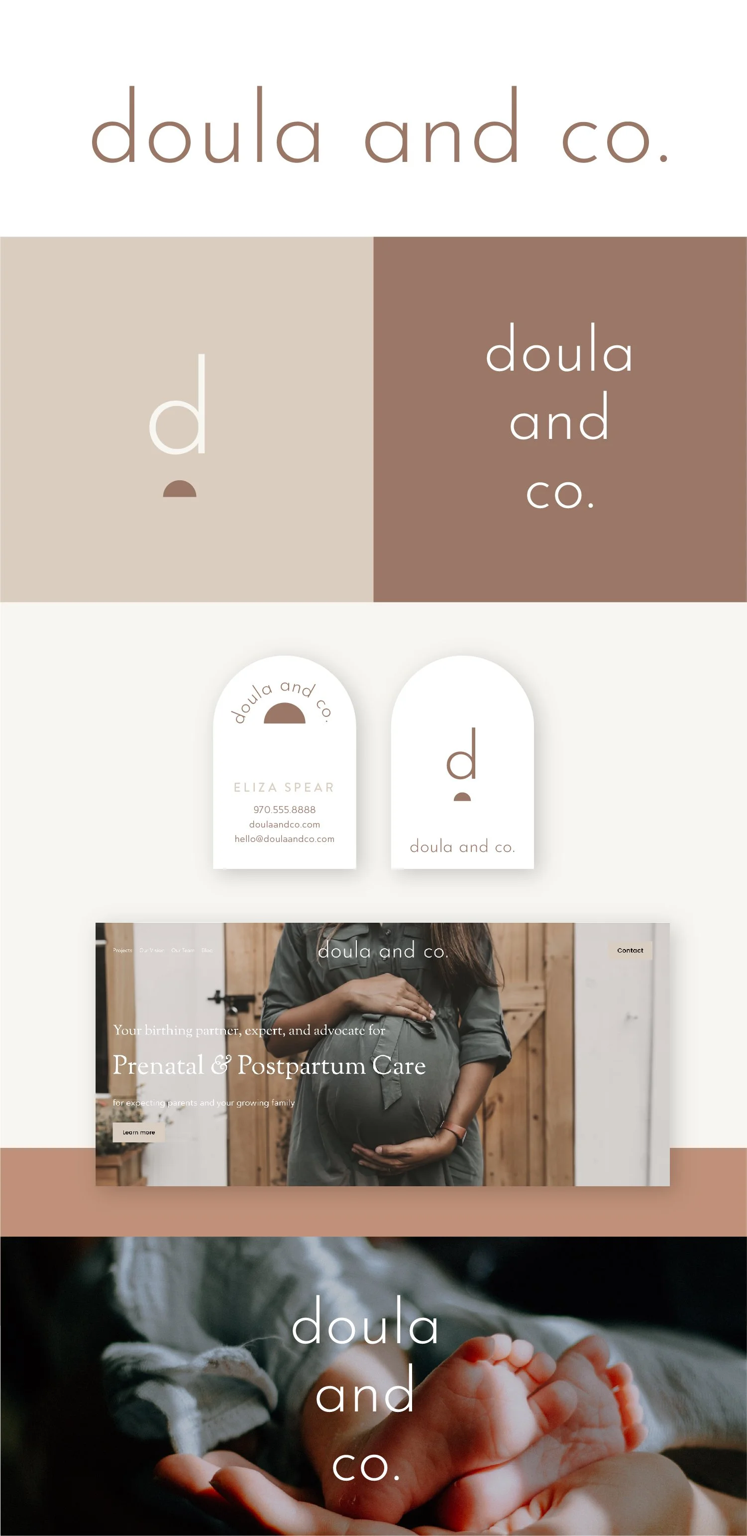
One of the strong suits of this concept is that by being paired down to a very minimal aesthetic, it creates a very calming effect. In a time when expecting parents may often feel overwhelmed, this font treatment reads as supportive and caring.
Using all lowercase letters feels familiar for a baby/children’s brand, but it still feels clean and refined. The lower case “d” and “l” have been customized to be a little taller to bring in a feeling of growth.
The half-circle in the initial mark is very grounding and to harnesses the same grounding feeling of support that you provide to your clients. With this concept, I imagine possibly integrating some subtle textures (like painted swathed of color) on the website to create more depth and a distinct look.
Concept 2
One of the key points of this concept is the customized curvature in the letters. It creates a subtle reference to pregnancy without feeling overly apparent or too in your face. The customization of the letters also brings a friendly and approachable appearance. It makes the overall tone feel welcoming. I think the movement within the letters also helps to conjure the idea of ushering in change and a new phase.
The curvature is something that can be repeated in brand elements like in the letter initial and the half-circle shape in the alternate logo composition. This shape can also be repeated/layered to create more distinct brand elements like in the photo overlay.
Concept 3
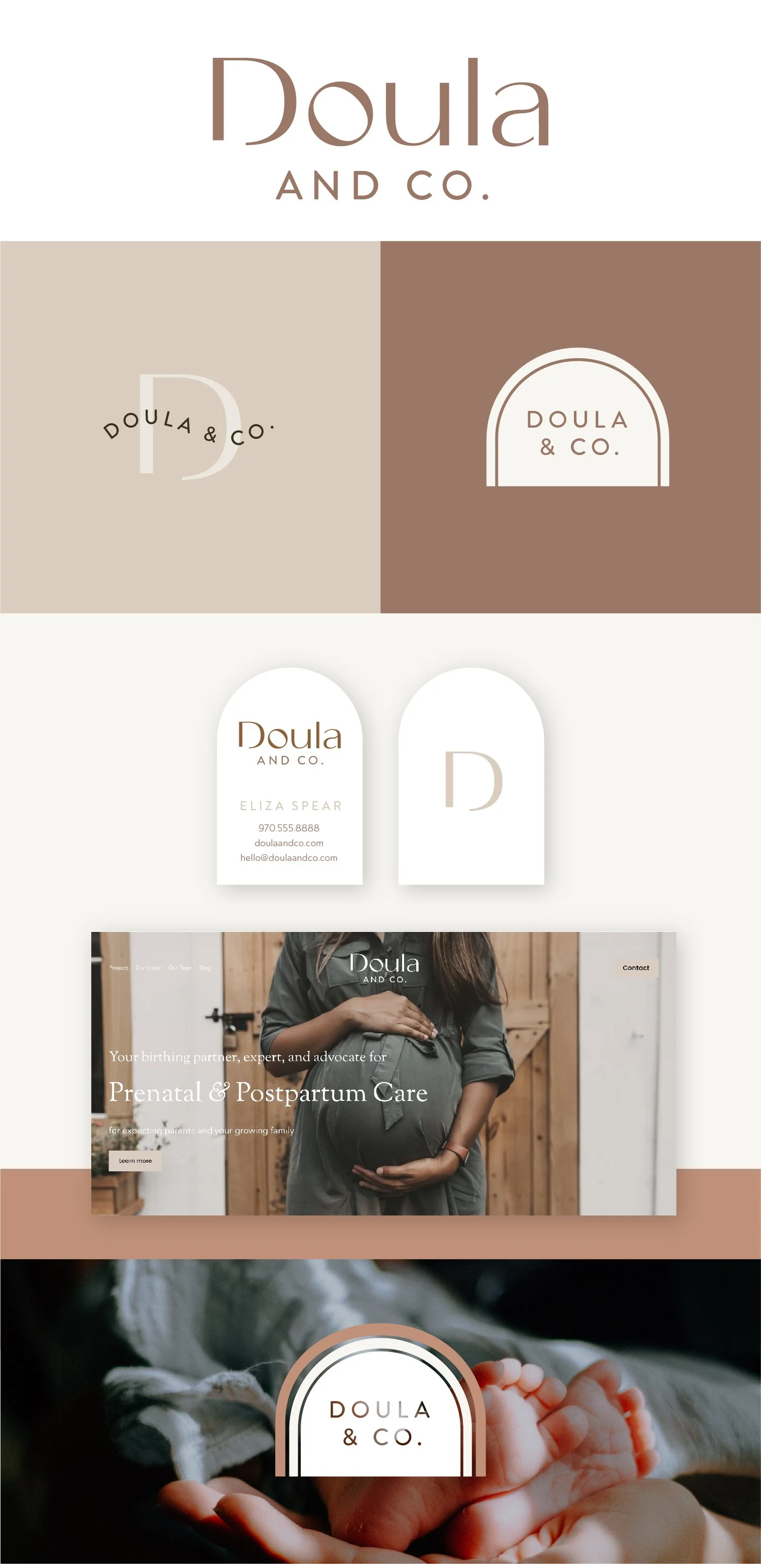
This concept still has a clean and minimal look, but the font has more of a classic style. I think this will work really well for versatile applications and the submarks/secondary logos bring in more personality.
The initial monogram is has the different letters pieced together which I think creates a distinct mark but can also be a nod to a family unit.
The semicircle is incorporated more as an element in the curved text in the stacked logo text and as an element in the business card. I imagine the rounded lines on the business card would be the embossed/raised portion of the card.


