Coldiron Photography
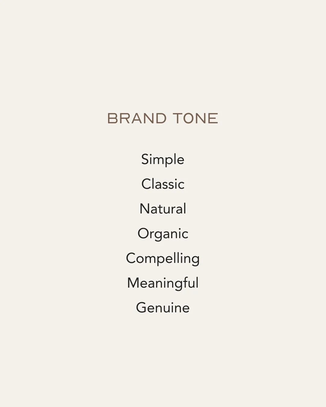
Summary
**The taglines are placeholder info and can be updated in revision rounds.
Below each of the three concepts shows the
Horizontal Logo (with Services Tagline)
Initial/Logo Mark, Photo Overlay
Alternate Logo Composition
Circular Logo
Logo Mark
Business Card Mockup
Door Decal Mockup
Skincare Product Mockup
Note
While each of these designs are meant to show a developed idea of each concept, each will be refined and the chosen concept will be carefully considered and added to until the brand is the strongest representation it can be.
Business card concepts and the homepage mockup are meant to show how the brand can progress beyond the logo alone and will be refined along with the logo. Additionally, the information shown is placeholder information.
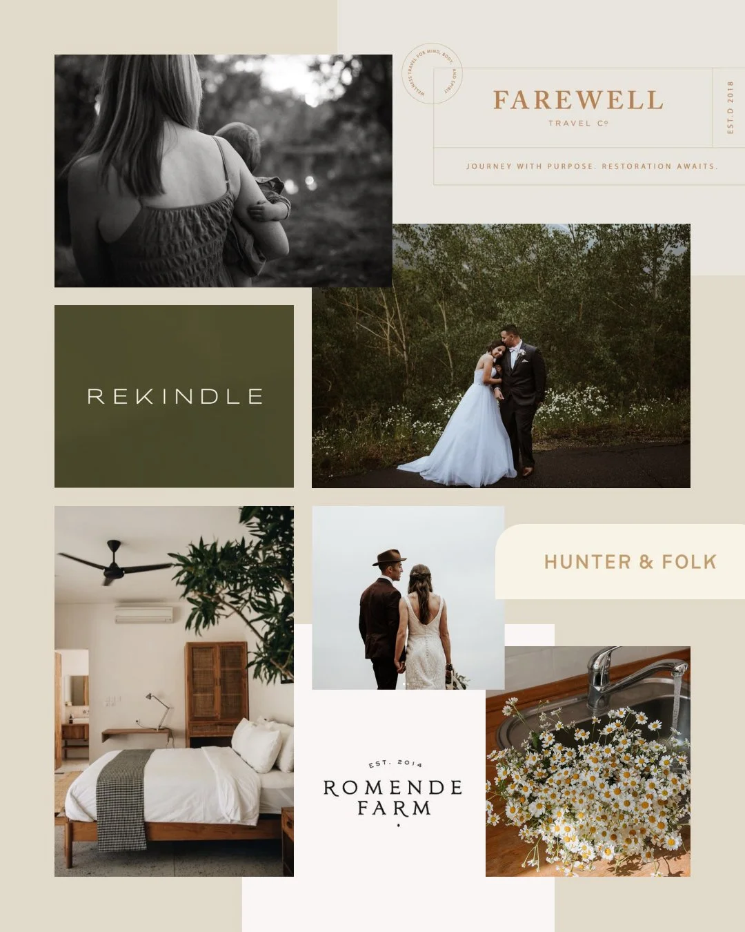
Moodboard
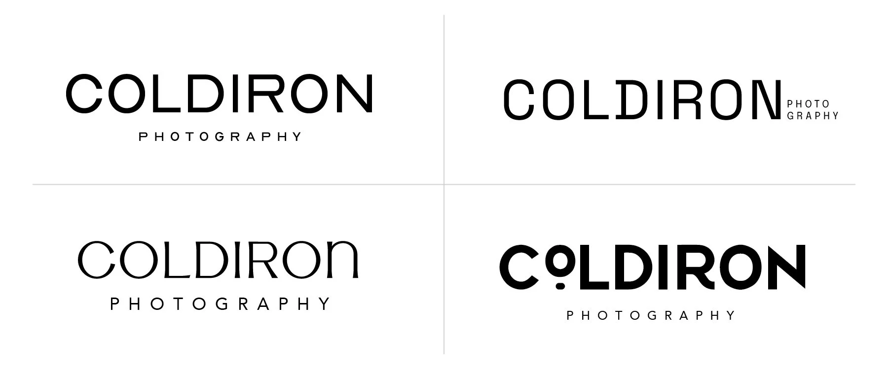
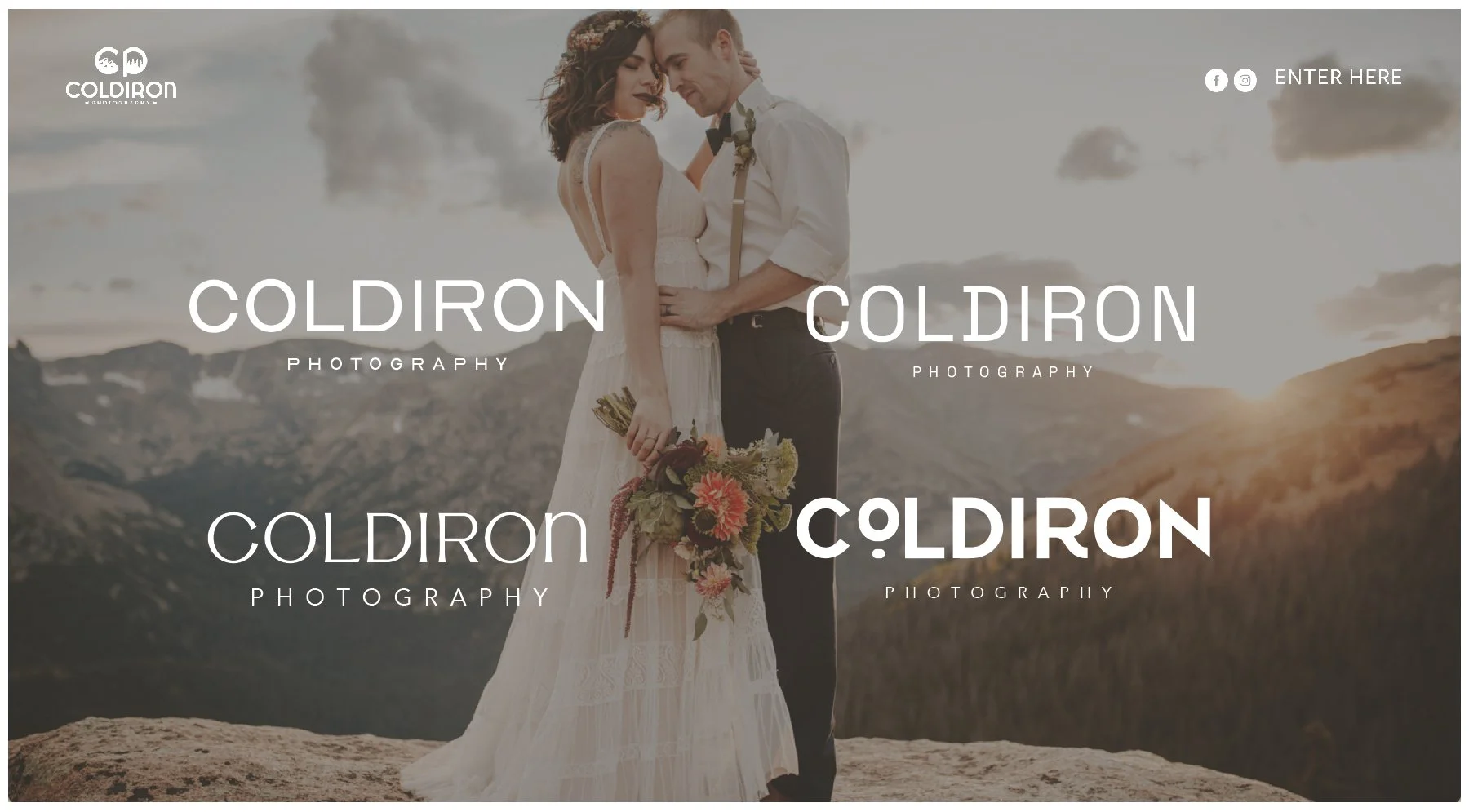
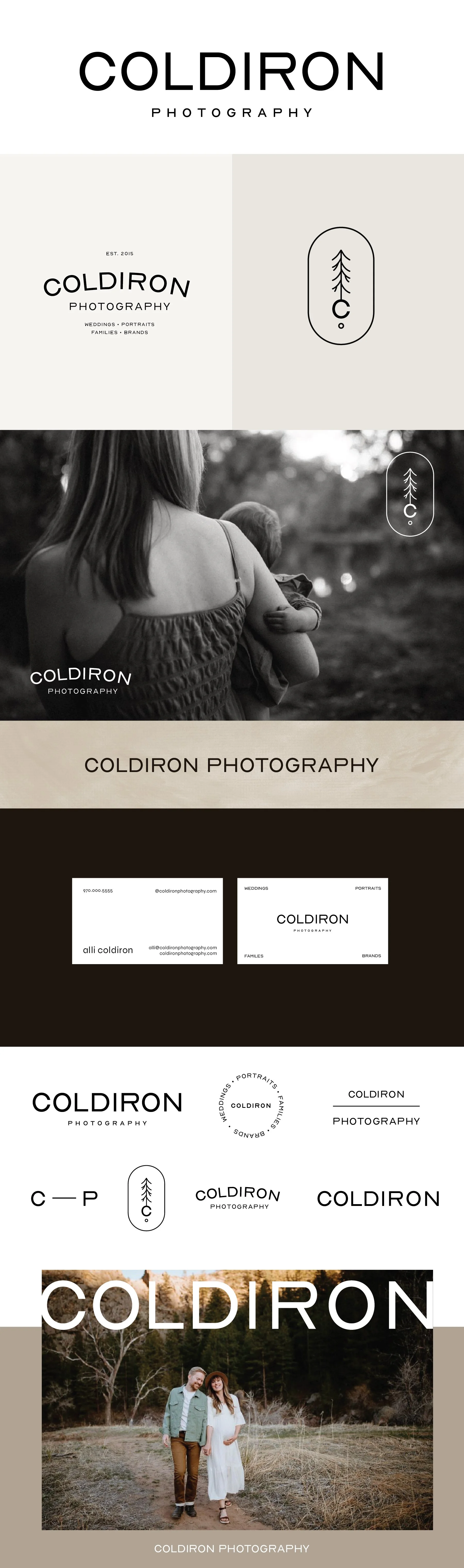
Concept 1
Key descriptors: modern and minimal
I love the R in this concept. I love when one letter can create a distinct look without feeling distracting so your logo has personality but it’s still a really simple, minimal look. It feels like it pairs really well with the actual word of your name. It has a strong, stable, timeless quality about it. This one has a similar feel to Article in that it is simple, and impactful in its understatedness.
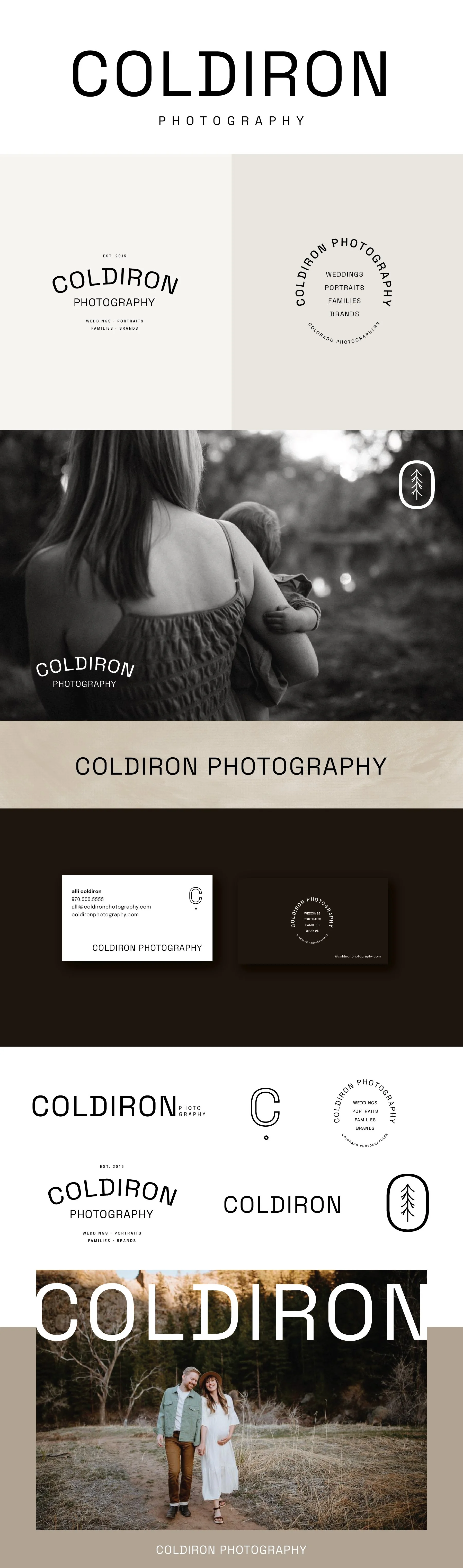
Concept 2
Key Descriptors: Timeless but trendy
I love how versatile this concept is. It has a few trendy qualities that make it feel current, but an overall timeless appeal that will make it work well for years and years to come. The letters are distinct enough that they they have personality, but are streamlined enough that they work well in a lot of different configurations.
Concept 3
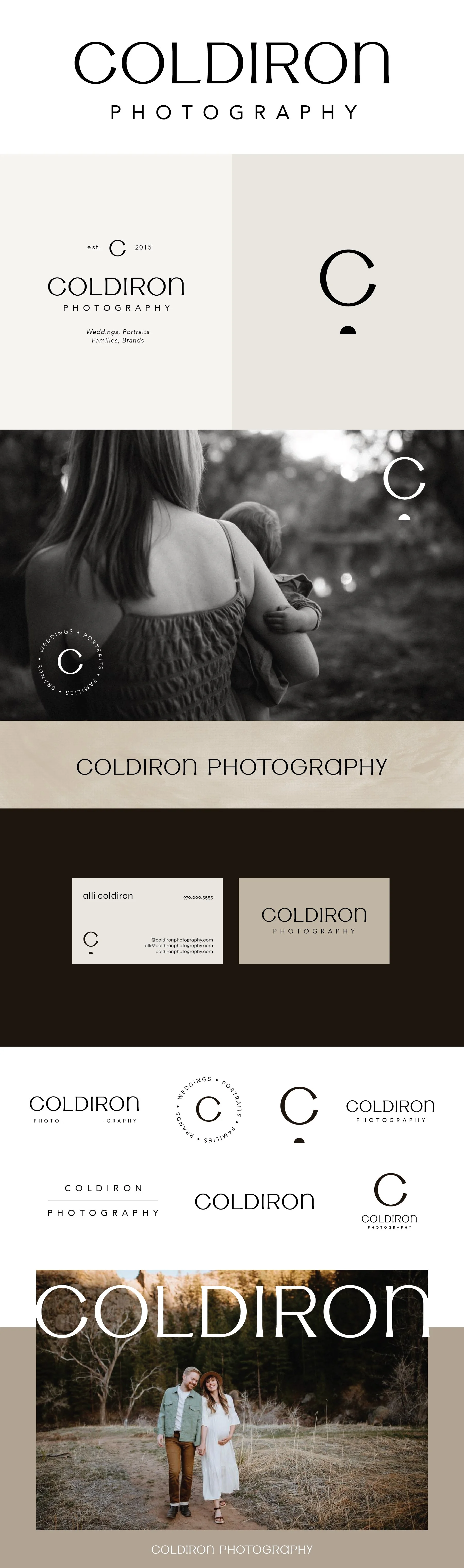
Key descriptors: refined, character, a touch more feminine, inviting
The letters in this concept have some great character with the way they become slightly wider at the edges and narrow in the middle. I think it brings in a really modern, refined look and has a lot of distinction as well.
Concept 4
Key descriptions: A little more playful, warm, and organic
To balance the more playful elements, there are still a lot of clean, linear elements. The accent under the O and the curvature of the R bring in a little personality and character. I think this one feels family-friendly and has a really good mix of masculine/feminine. The font in this concept is the boldest and heaviest of the four options, so it does feel like the most “statement” of the concepts.