FUMC Co-op PreSchool
Summary
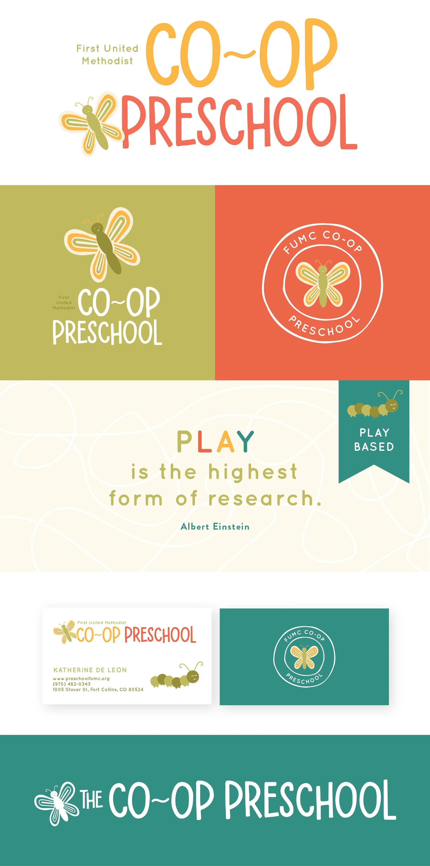
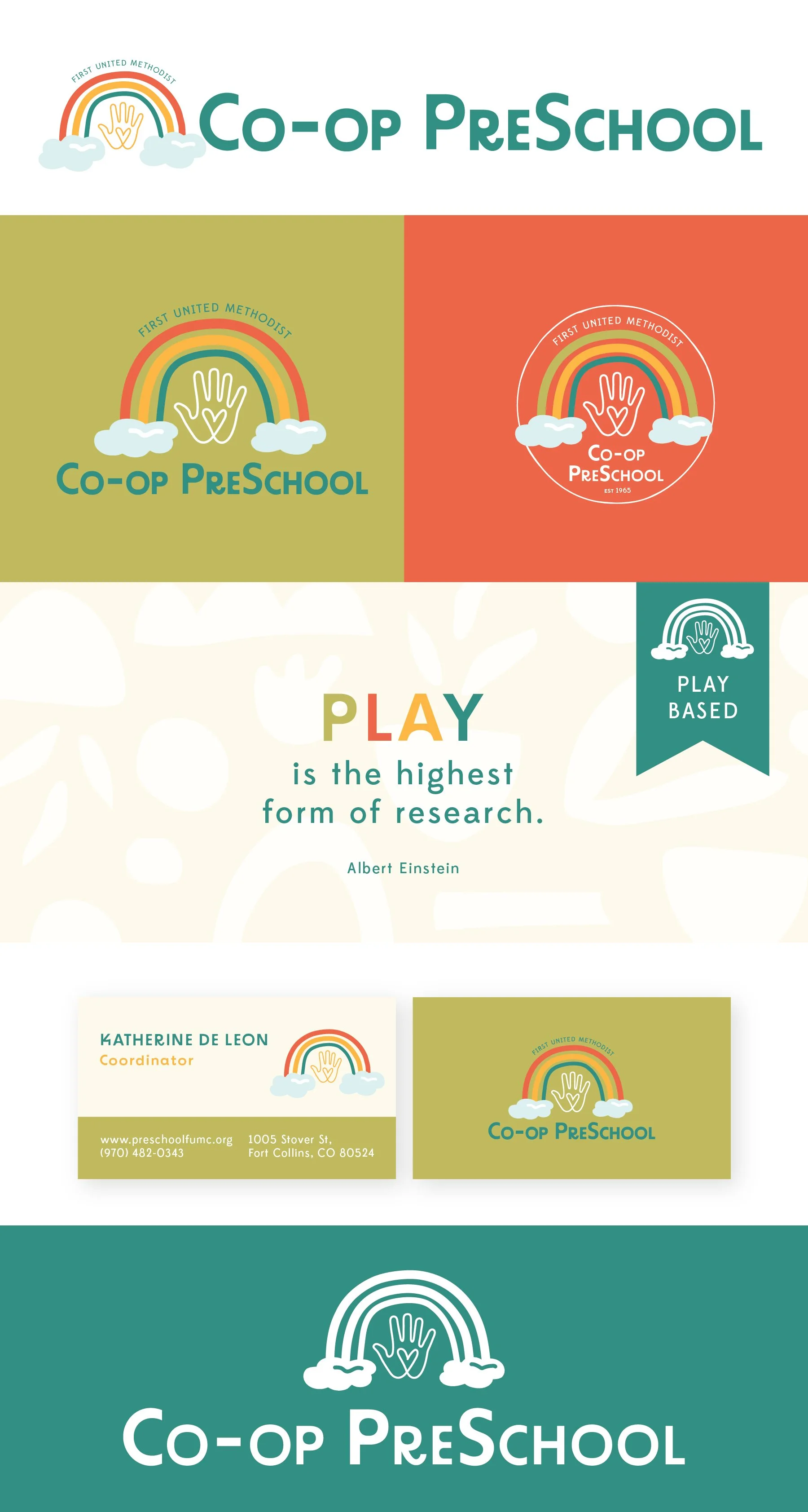
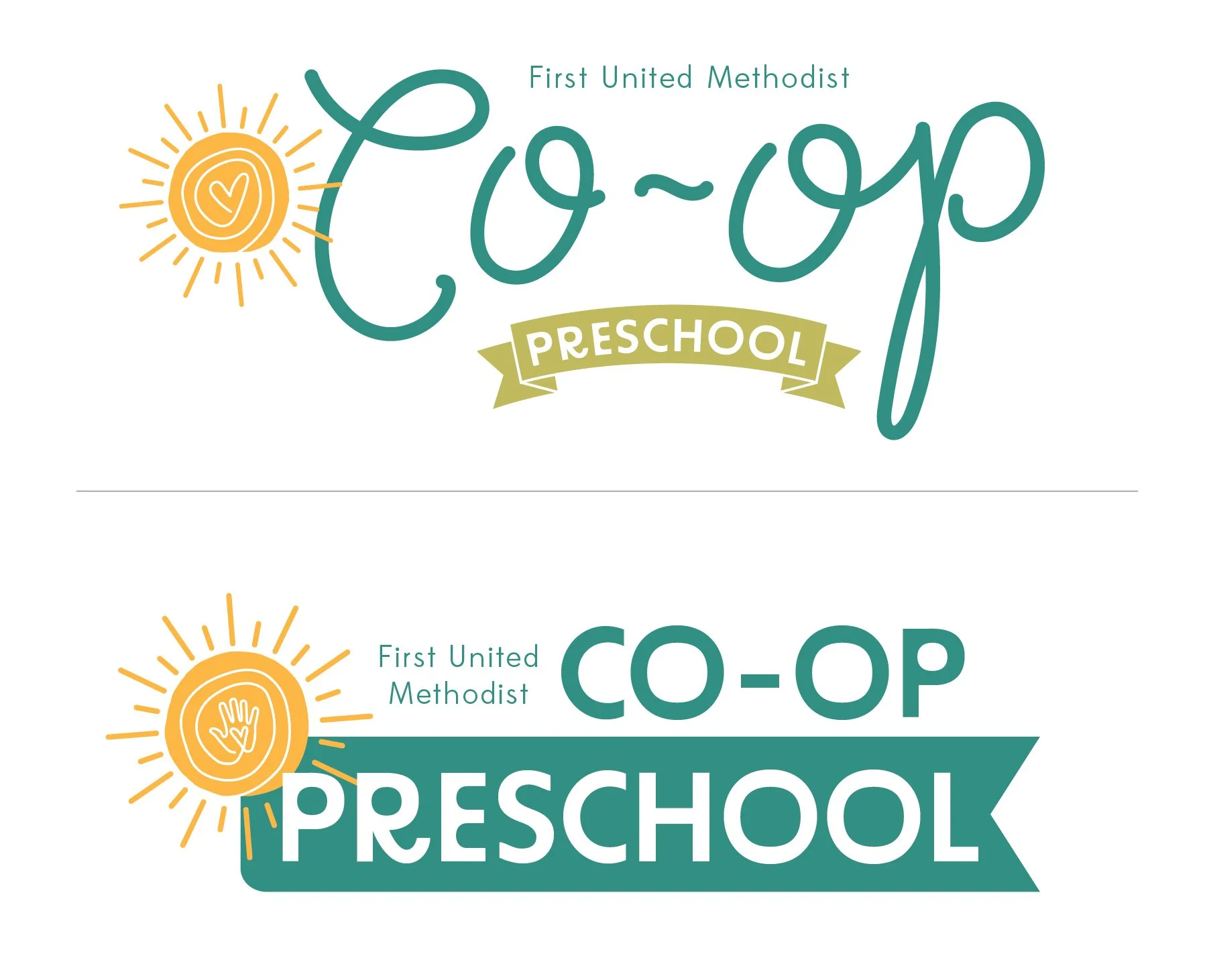
First United Methodist Co-op PreSchool
**The taglines are placeholder info and can be updated in revision rounds.
Below each of the three concepts shows the
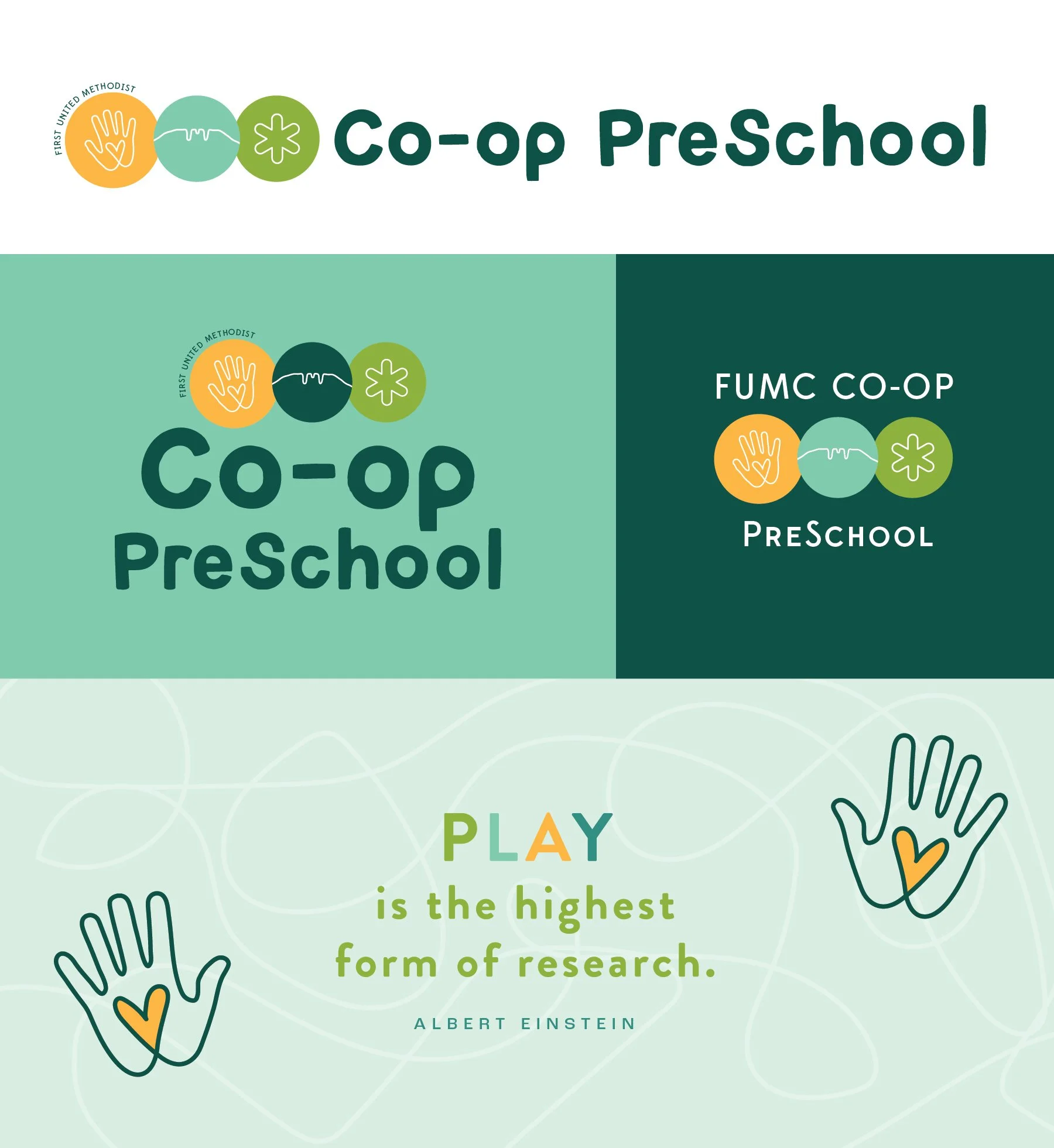
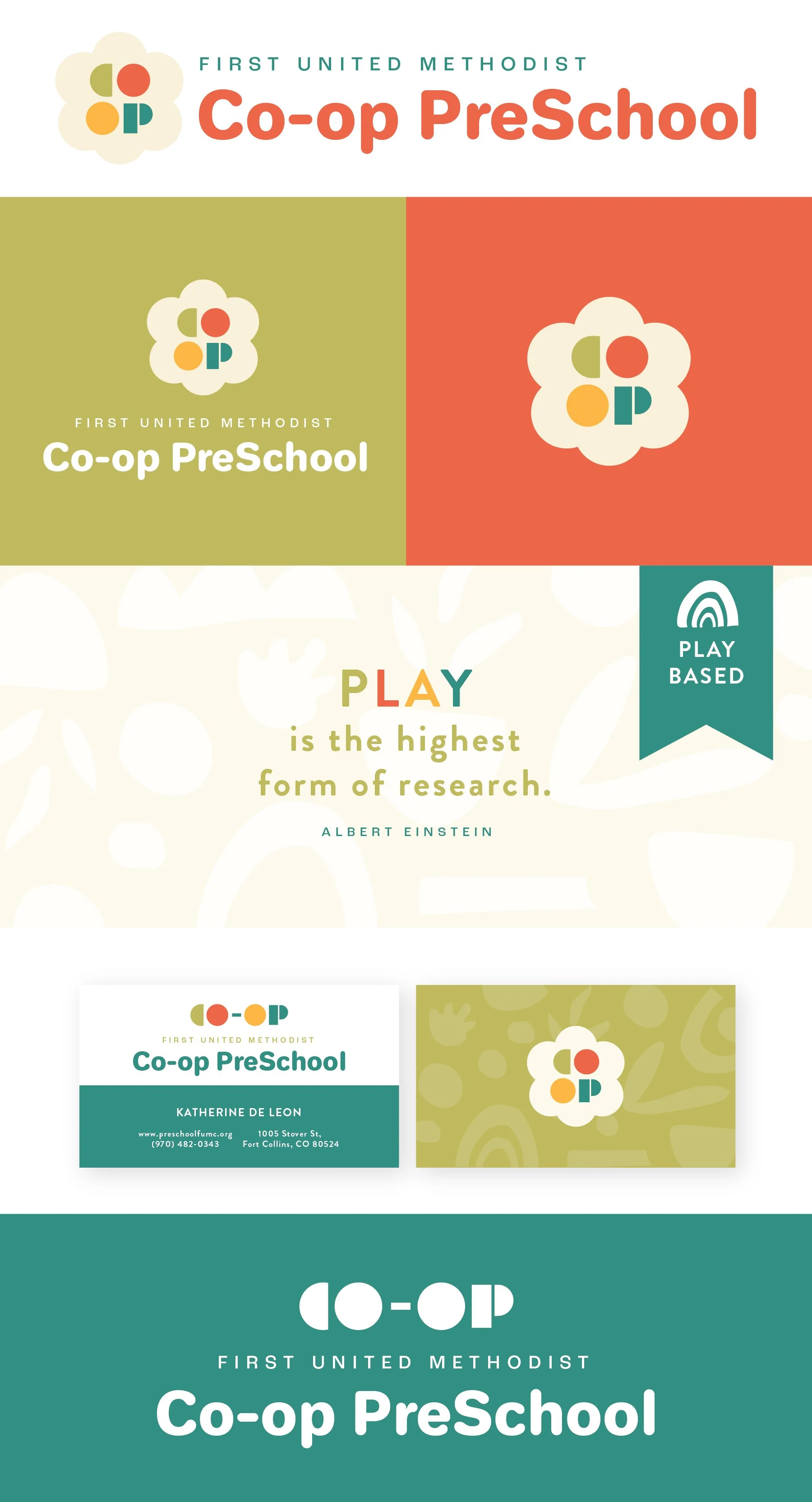
Primary, Vertical Logo
Initial/Logo Mark
Alternate Logo Composition
Business Card Mockup
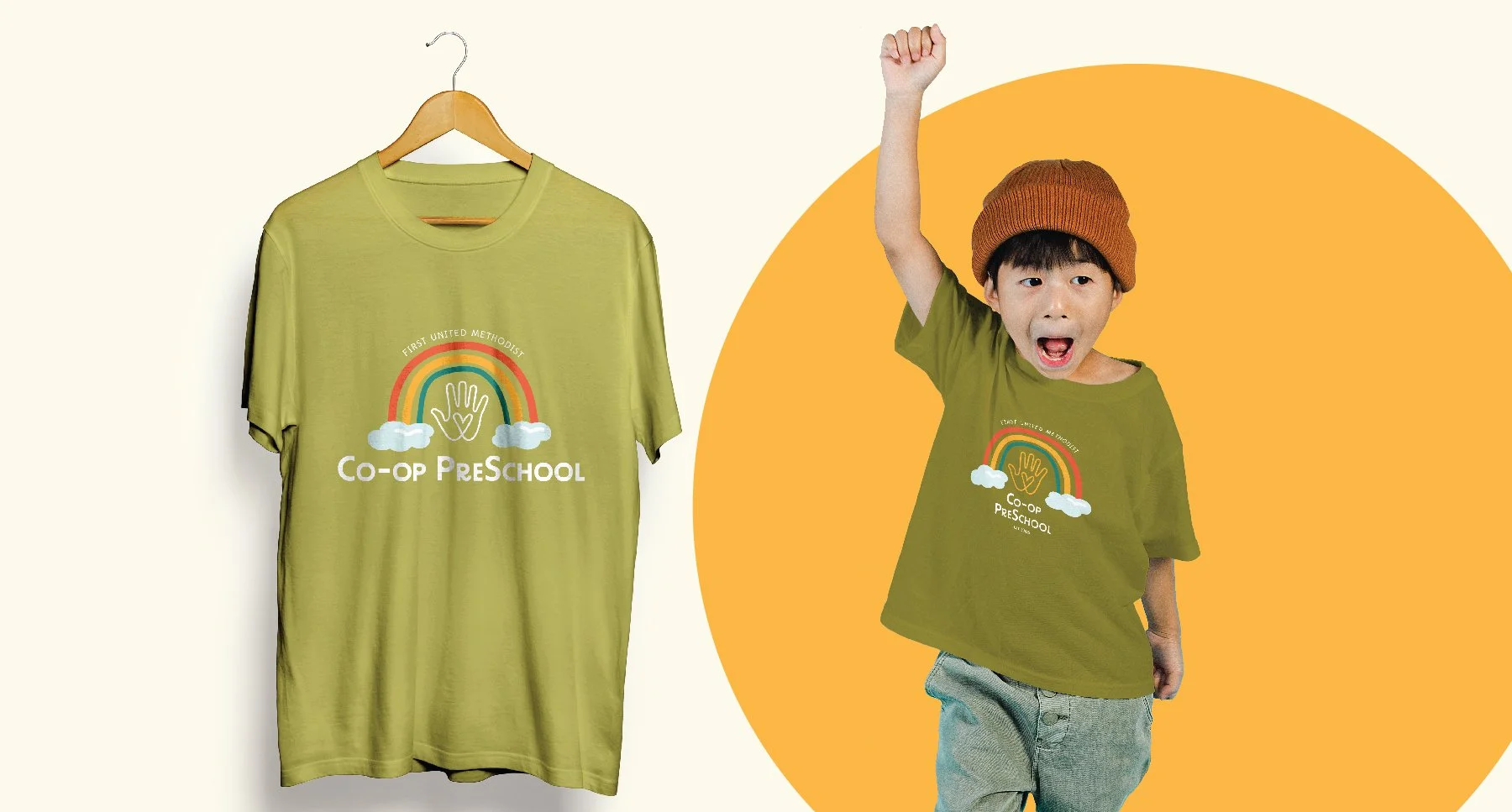
Photo Overlay
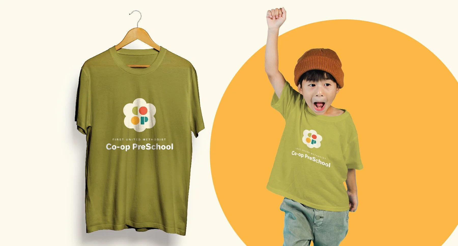
Shopping Bag Mockup
Logo Suite
Note
While each of these designs are meant to show a developed idea of each concept, each will be refined and the chosen concept will be carefully considered and added to until the brand is the strongest representation it can be.
Business card concepts and the homepage mockup are meant to show how the brand can progress beyond the logo alone and will be refined along with the logo. Additionally, the information shown is placeholder information.
Moodboard & Brand Tone

Play-based
Collaborative
Nurturing
Well-educated
Dedicated, resourceful
Enthusiastic
Adaptable
Kind
Nature-loving
Do-good-ers
Community-minded
Progressive,
Honest, trustworthy
Creative
Revisions
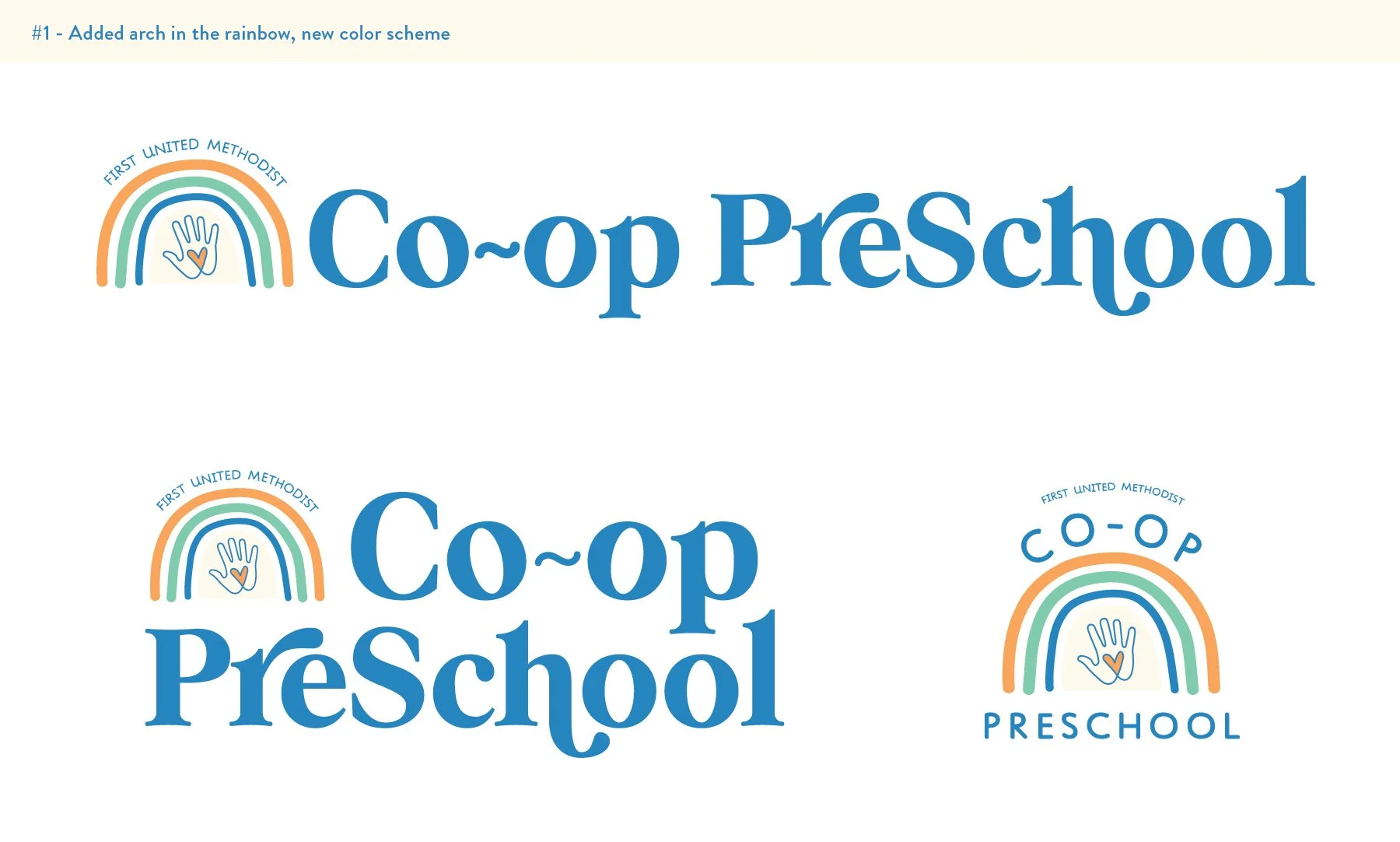
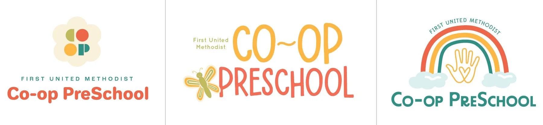
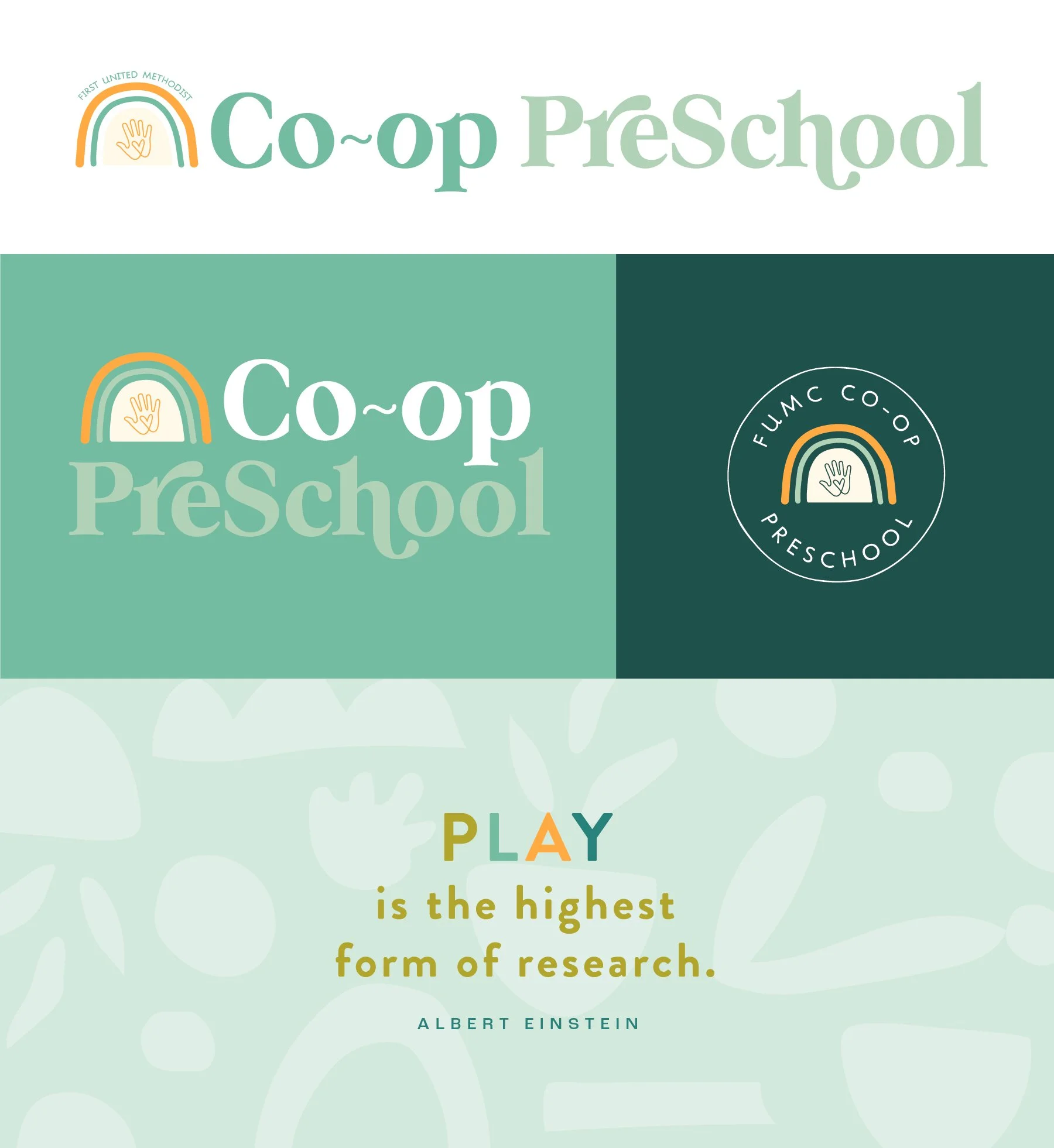
Revision: Concept 1
A simplified version of the original concept 3. Notable differences include:
Cooler color palette
Simplified logo mark (clouds removed)
Different font in title case - really playful and friendly tone
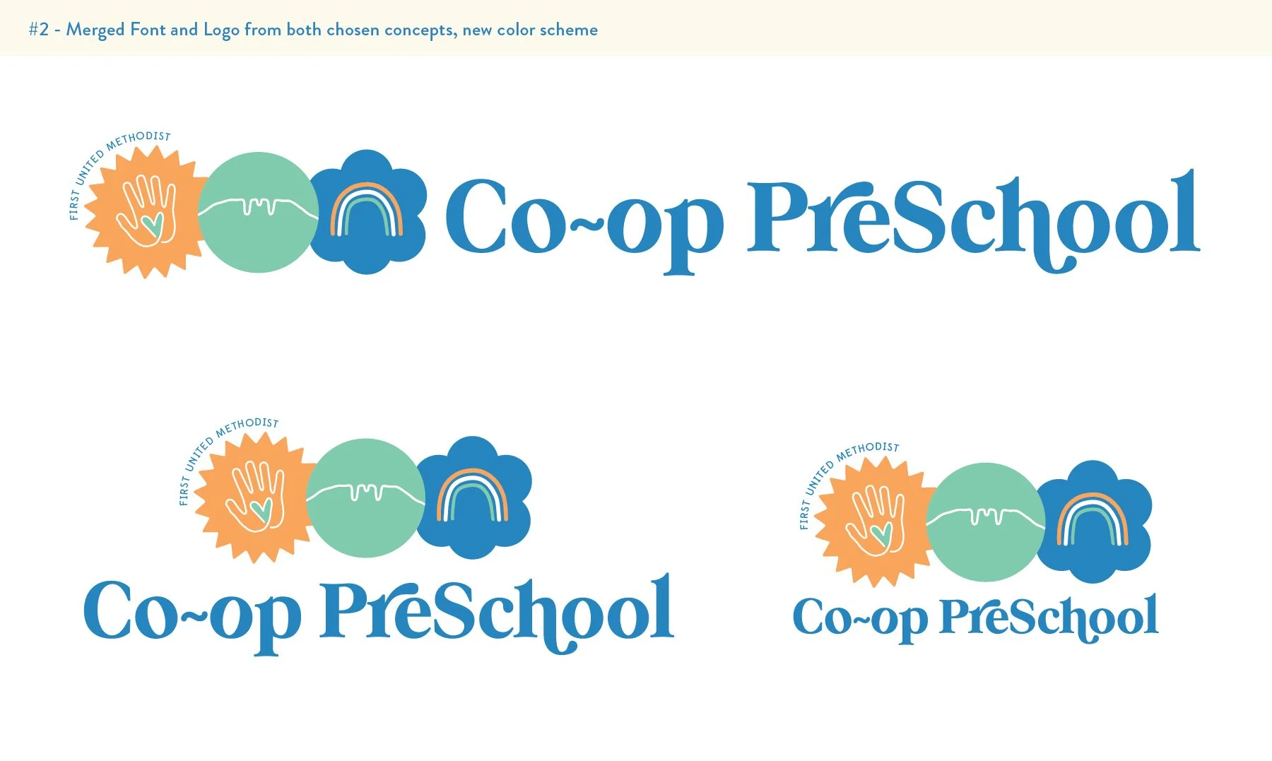
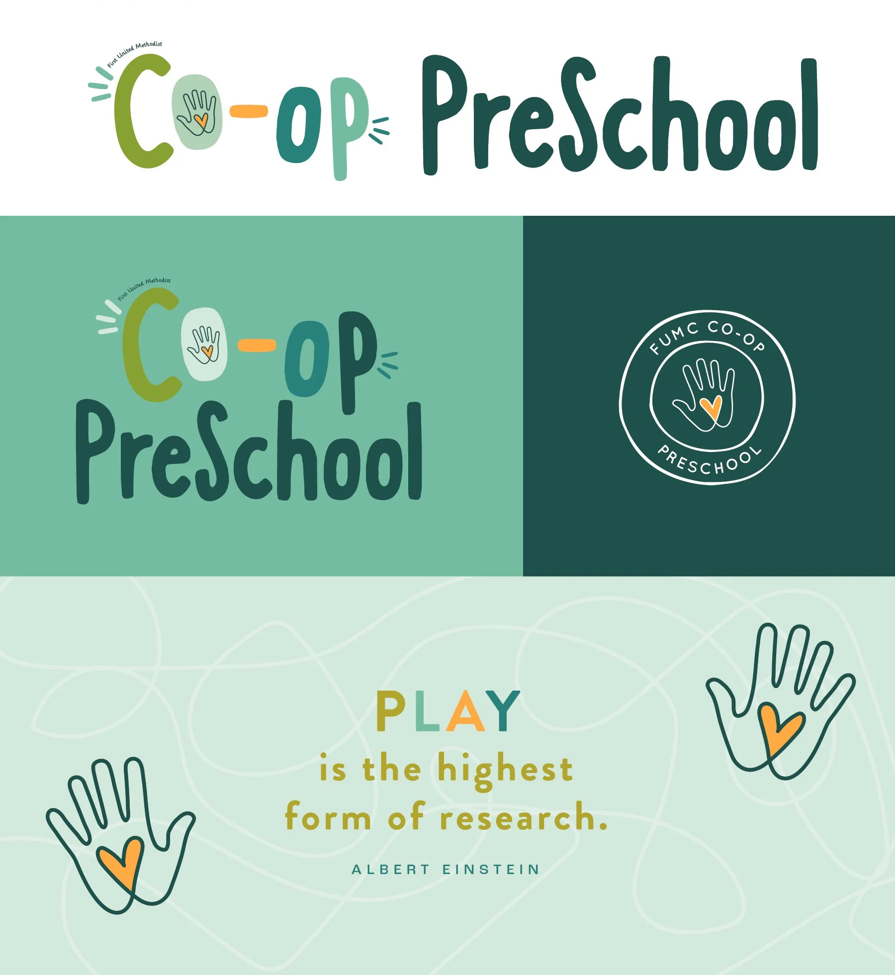
Revision: Concept 2
The idea behind this design is a simplified design overall with the hand being the singular visual element and letting a lot of the personality come from the playful font.
This reads as a very youthful style and I think would age well in the sense that it would work well for many years to come. The hand can be removed from the “o” and used on its own as well, so you would have a lot of versatility with it.
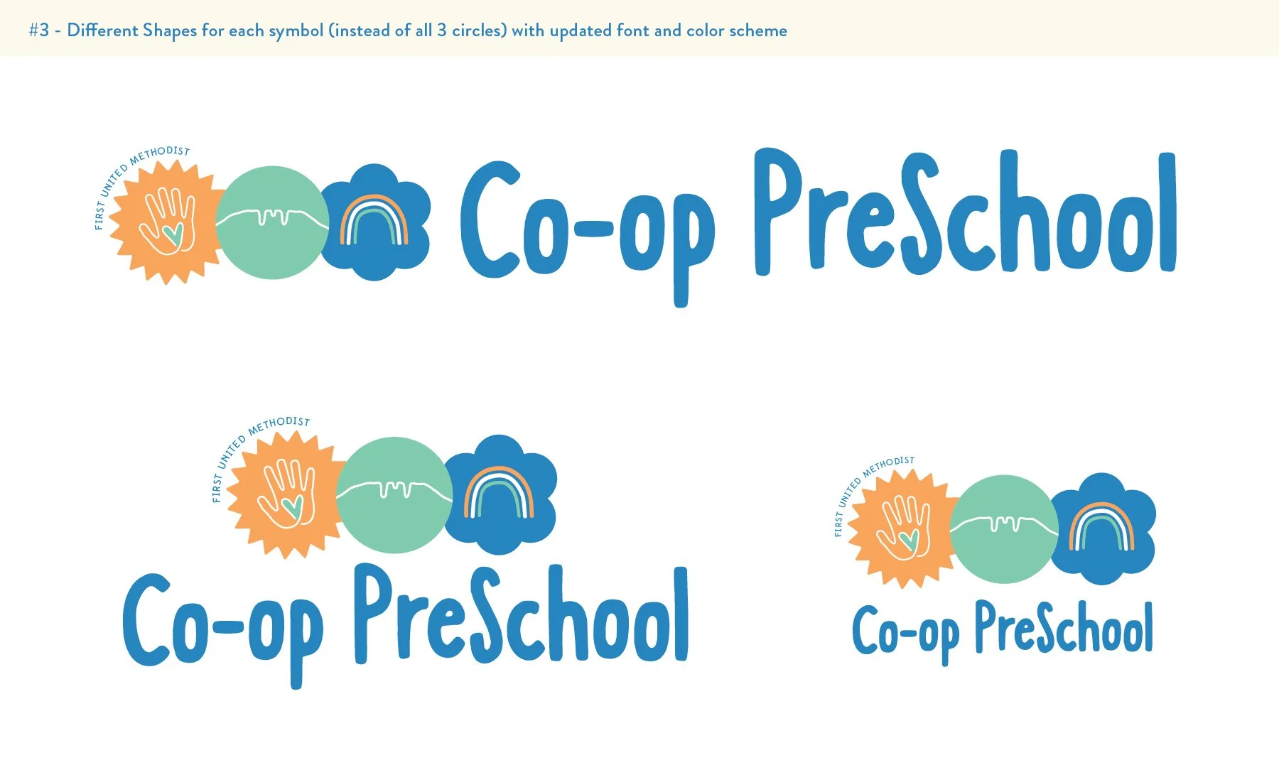
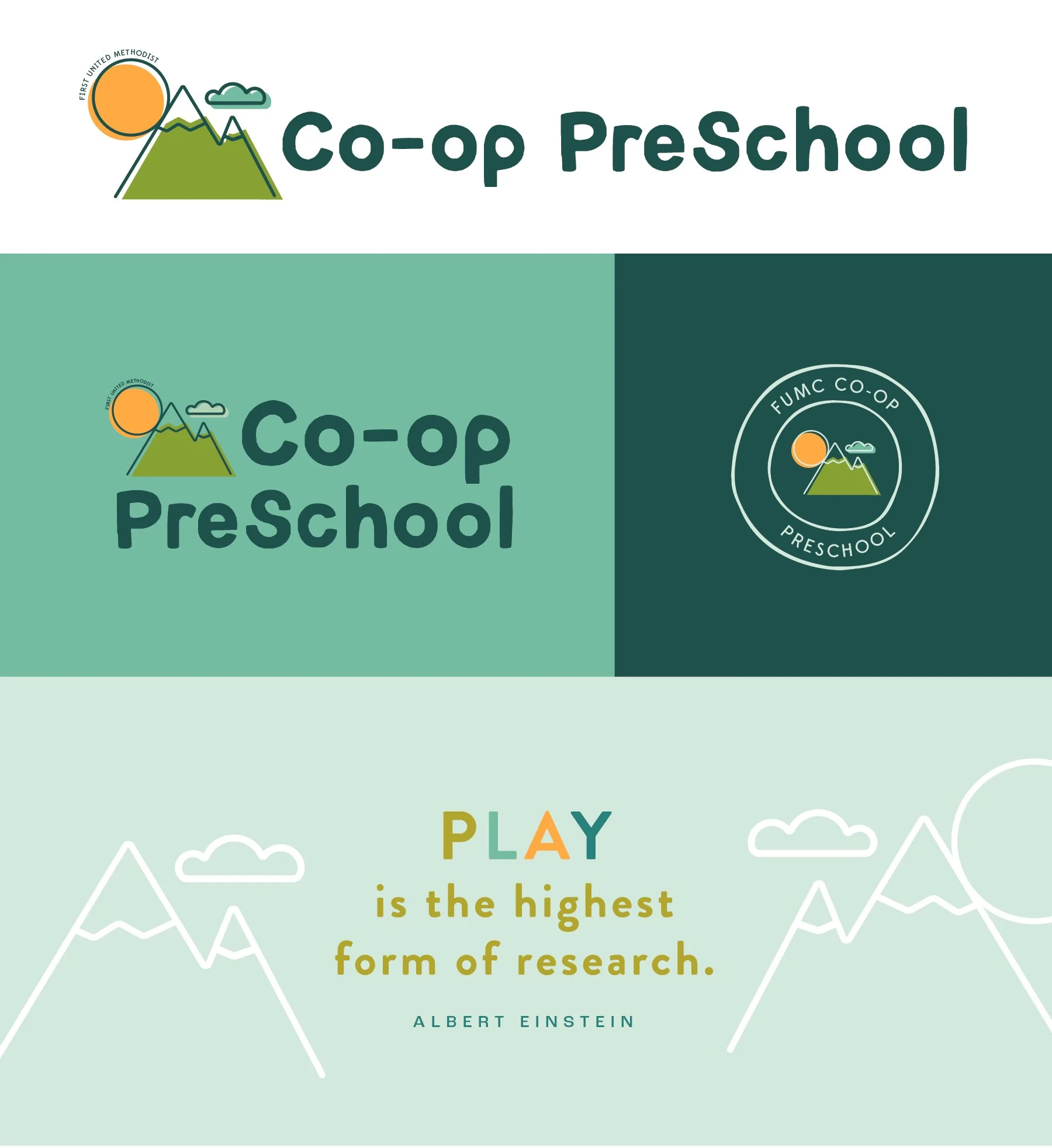
Revision: Concept 3
In this concept, the focus is on the outdoors (which can imply play) and nature. The shapes are simplified and feel playful, friendly, and age-appropriate for a preschool. The geometric shapes feel like they would be familiar, but feel distinct to FUMC.
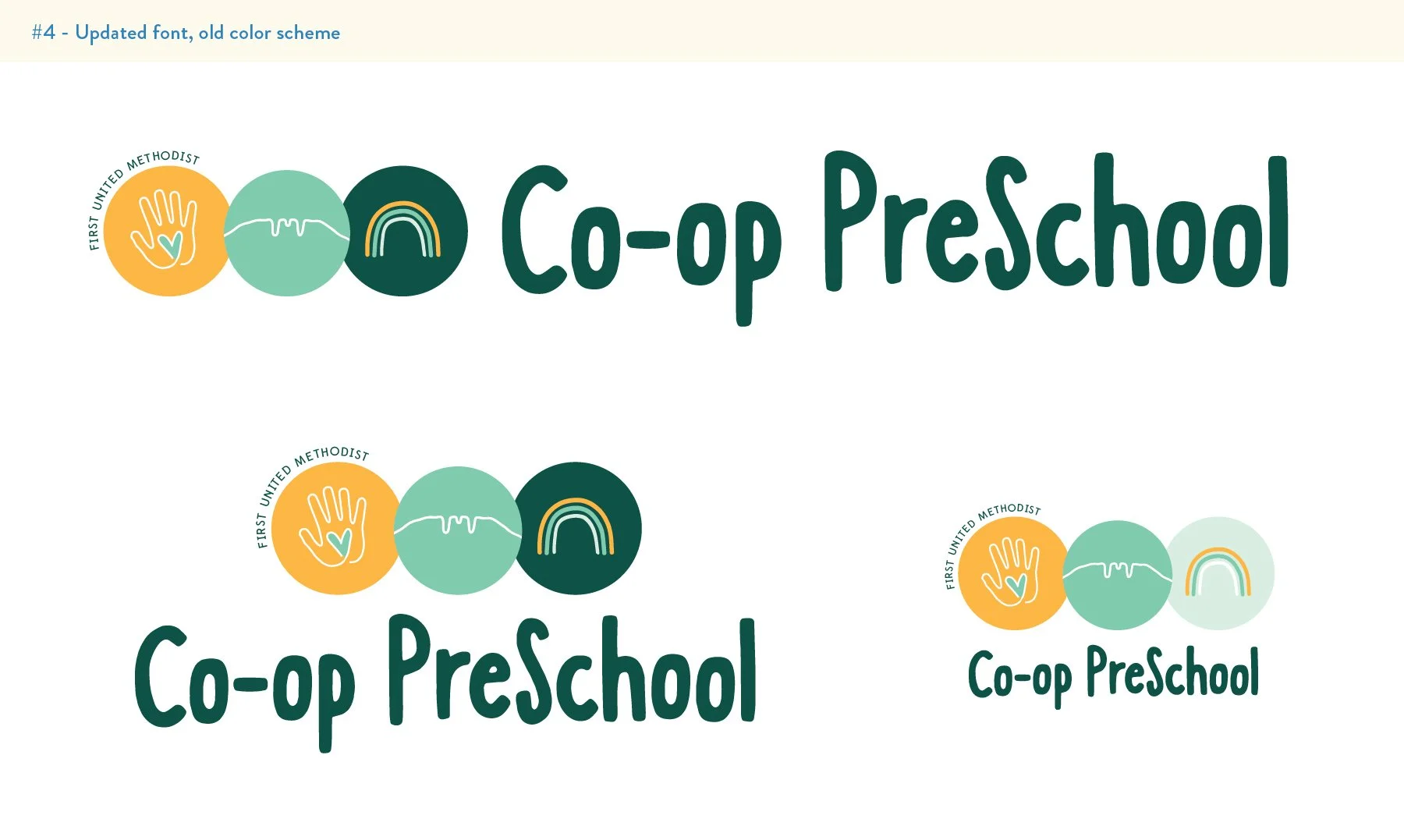
Revision: Concept 4
In this concept, the idea is to highlight some of the preschool’s pillars and keep an overall simplified style and approach. This felt like a good way to incorporate several visuals without it feeling crowded.
The hand + heart symbolize caring and kindness. It also keeps a nod to the school’s past handprint logos.
The Horsetooth outline references the outdoors and is specific to Fort Collins.
The flower/burst symbol represents play and imagination.
This is another one that I think will work well for a long time and can be pretty versatile.