Chance Encounter
Summary
Chance Encounteris an events-based dating company that is revolutionizing the relationship game. We host a variety of singles events at all price points to allow everyone to find love.
We are creating a safe, inclusive environment that removes the pressure and stresses of online dating, helping each individual write their own Chance Encounter.
The overall brand tone is meant to be Creative, Community focus, Connection, Safe, Exciting & Energetic, Innovative, and Comfortable.
**The taglines are placeholder info and can be updated in revision rounds.
Below each of the three concepts shows the
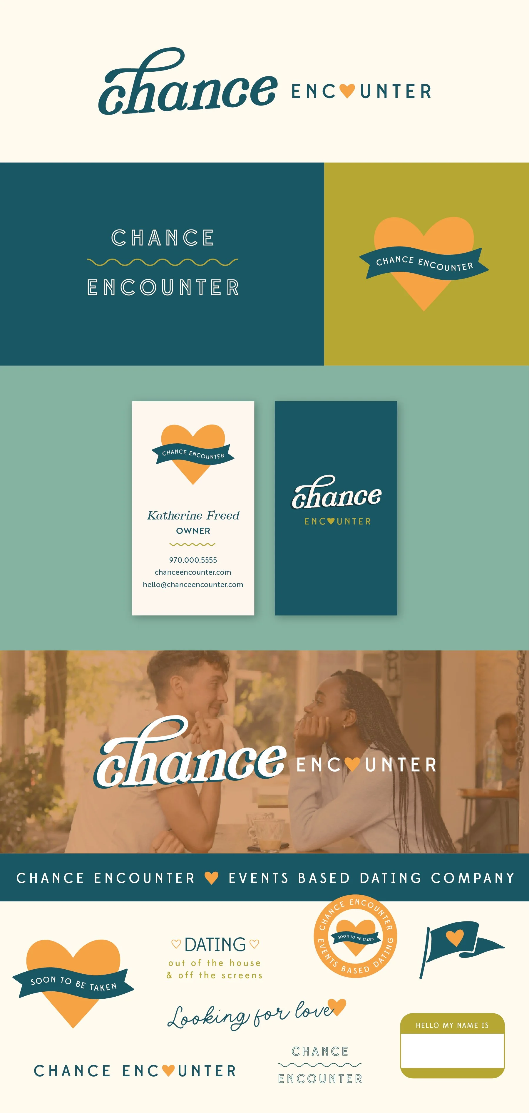
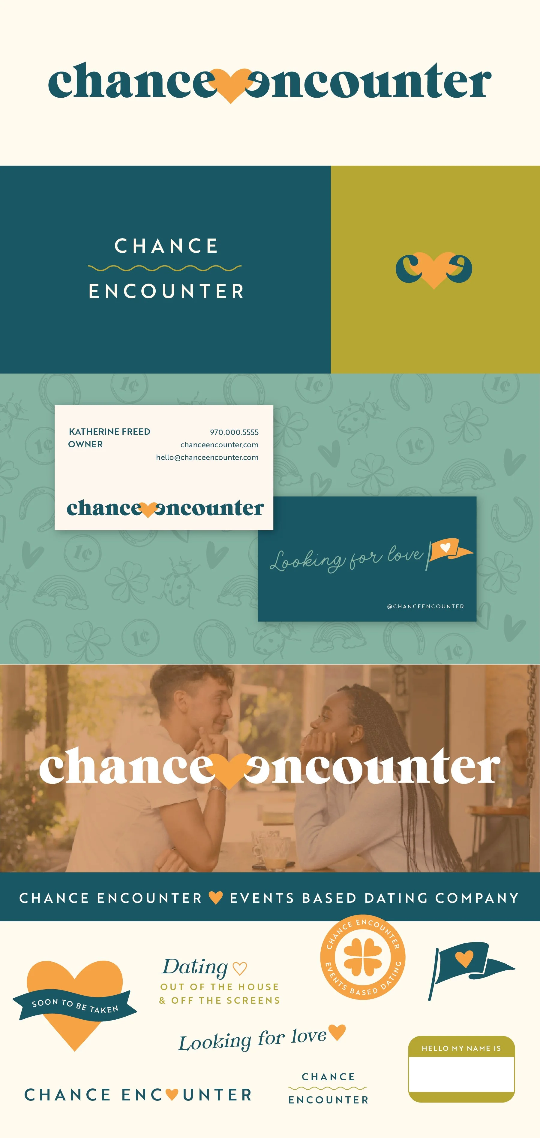
Primary, Vertical Logo
Initial/Logo Mark
Alternate Logo Composition
Business Card Mockup
Photo Overlay
Shopping Bag Mockup
Logo Suite
Note
While each of these designs are meant to show a developed idea of each concept, each will be refined and the chosen concept will be carefully considered and added to until the brand is the strongest representation it can be.
Business card concepts and the homepage mockup are meant to show how the brand can progress beyond the logo alone and will be refined along with the logo. Additionally, the information shown is placeholder information.
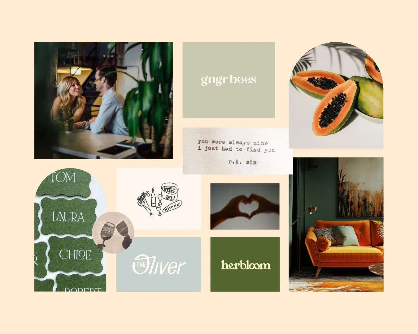
Moodboard
Initial Concepts

Concept 1 - Inviting, Bubbly
I love the subtle inclusion of the direct references. You unmistakably pick up on the heart and the location pin, so you know it’s about “looking for love” or “find love here”. The font itself is playful and inviting and it has a broad appeal to a large audience. I think this would work well for women, men, and a broad age range.
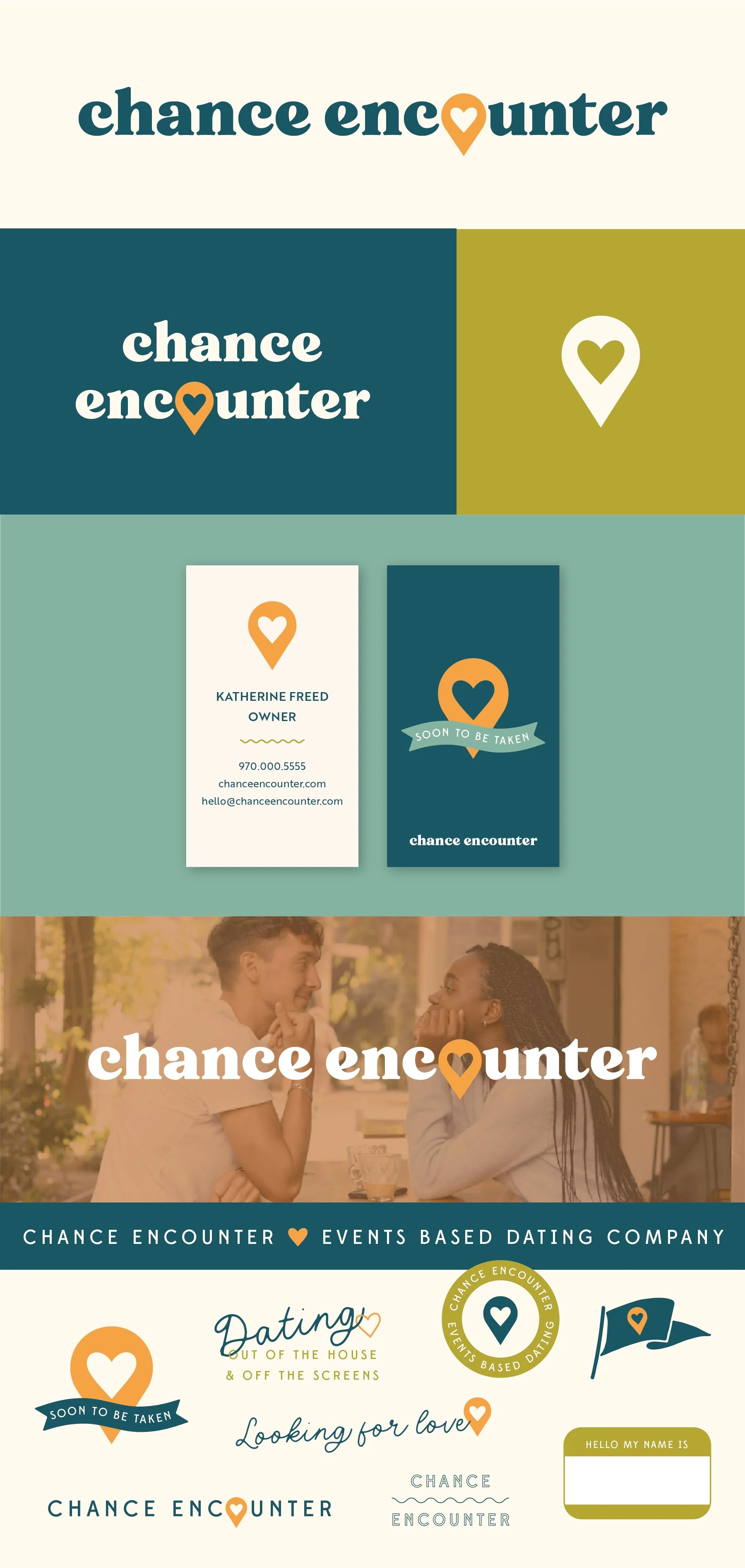
Concept 2 - Clever, intriguing
This concept has a really playful, intriguing element of the two letters “meeting”. The logo tells a story and has a hopeful, sweet message.
For the logo mark, it also works well to have the c and e telling the same story.
*This option has an illustrated pattern in the background of the business cards that could be used with any of the Concepts.
Concept 3 - Sweet, Romantic
I wanted to include one option that uses two different fonts in the logo to emphasize the words differently. The font for Chance has more of a romantic feeling and the looped H makes the word look how “chance” feels. Then to balance that, encounter is more straightforward, with the heart as the romantic detail.