Brand Style Guides - What They Are & How to Use Them to Improve Your Business
Among the many reasons to invest in your branding, I would consider a brand style guide to be at the top of the list. It is the item I am asked about most often and most often asked to exclude from the branding package in order to reduce the cost. This post is to detail why style guides are important and how utilizing one can improve your business.
I often compare branding to cooking. It’s something you can do yourself by throwing together ingredients you have in the kitchen and while it may work out just fine, it doesn’t compare to chef prepared cuisine. In this metaphor, if your logo, colors, and fonts are the ingredients, your brand style guide can be considered the recipe. Once you have the quality “ingredients” the best thing you can do is use them consistently. Your brand style guide enables you to do that!
So what is a style guide?
A style guide is a document that outlines the visual standards of your brand and explains how to use them. This can be as simple as a single sheet or as complex as a multi page document outlining each detailed application of your brand. The size of the guide is often proportionate to the size of the company.
At a minimum, your guide should outline:
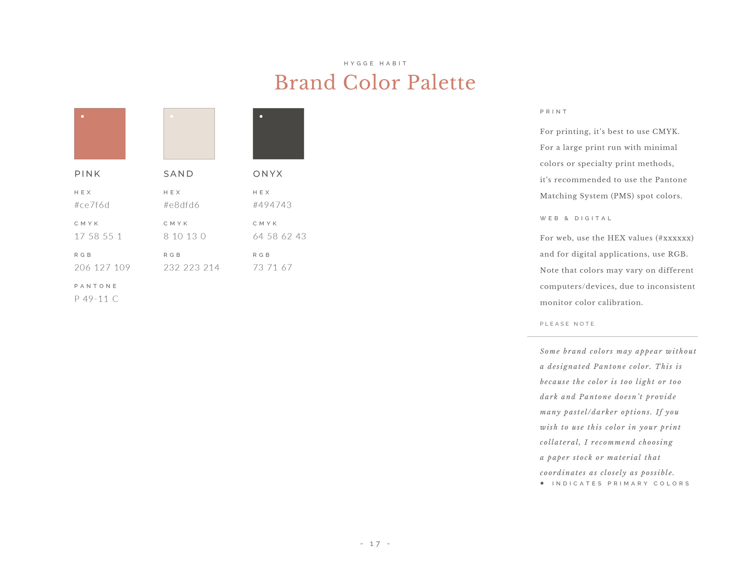
Branding Colors: The primary and secondary color palettes including color codes.
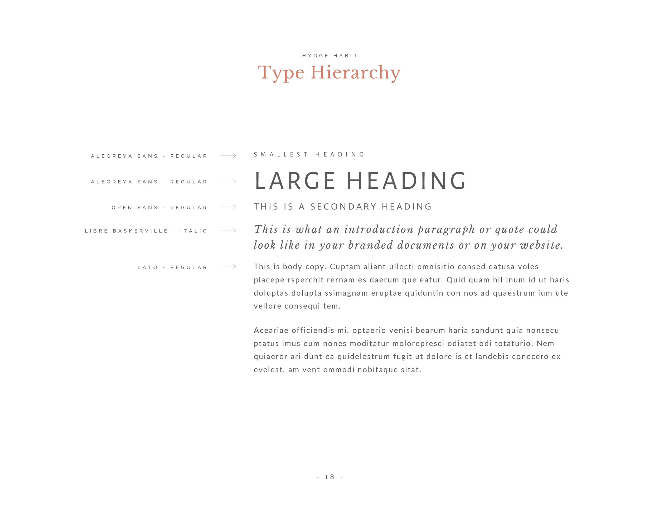
Typography: The typefaces you use and any specifications for use, i.e. bolded vs italic.
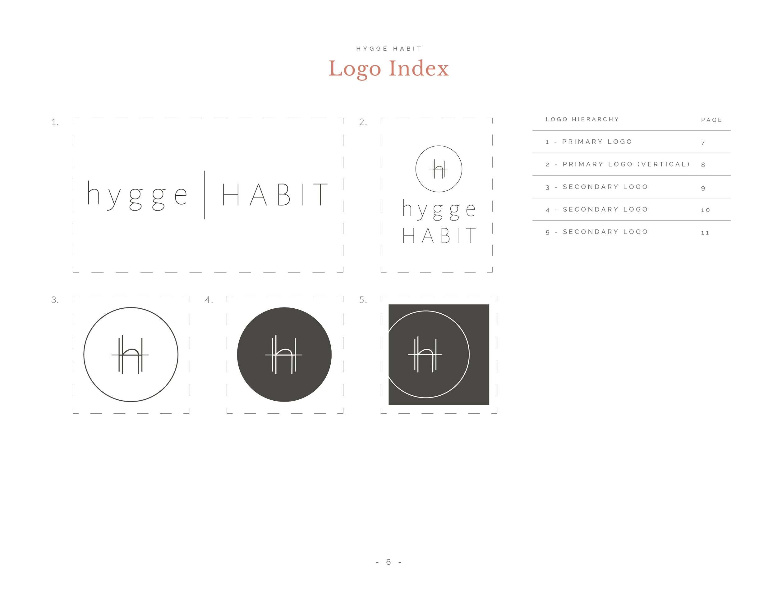
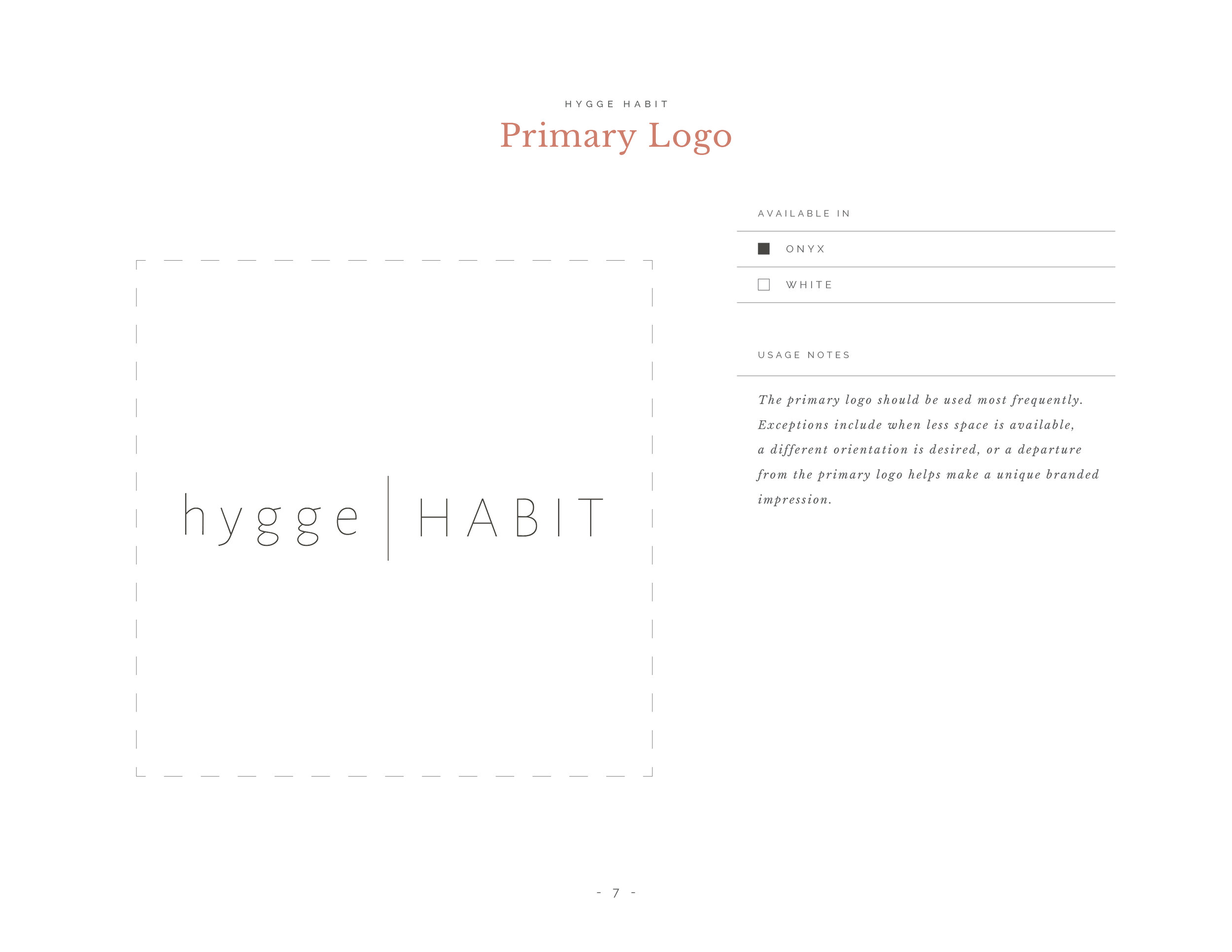
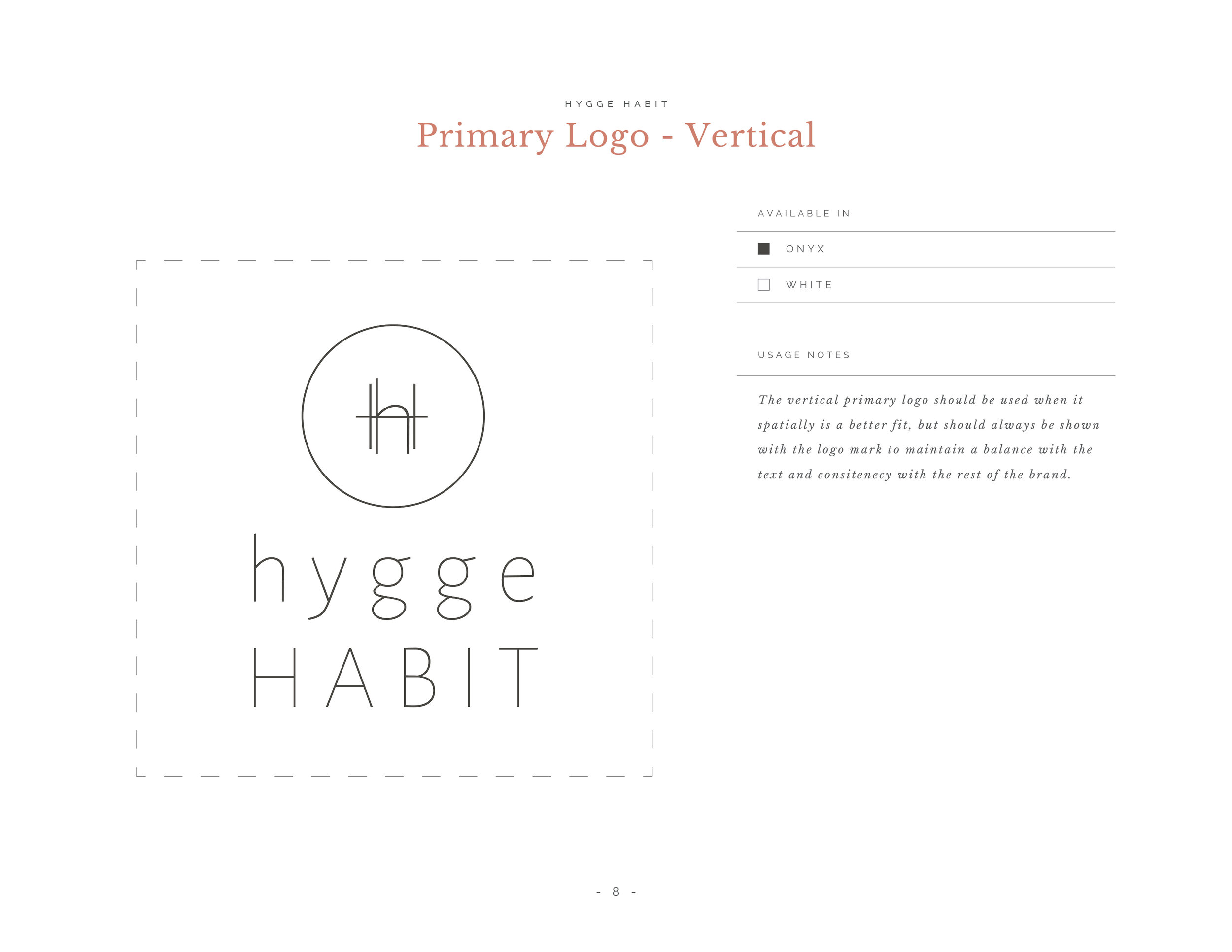
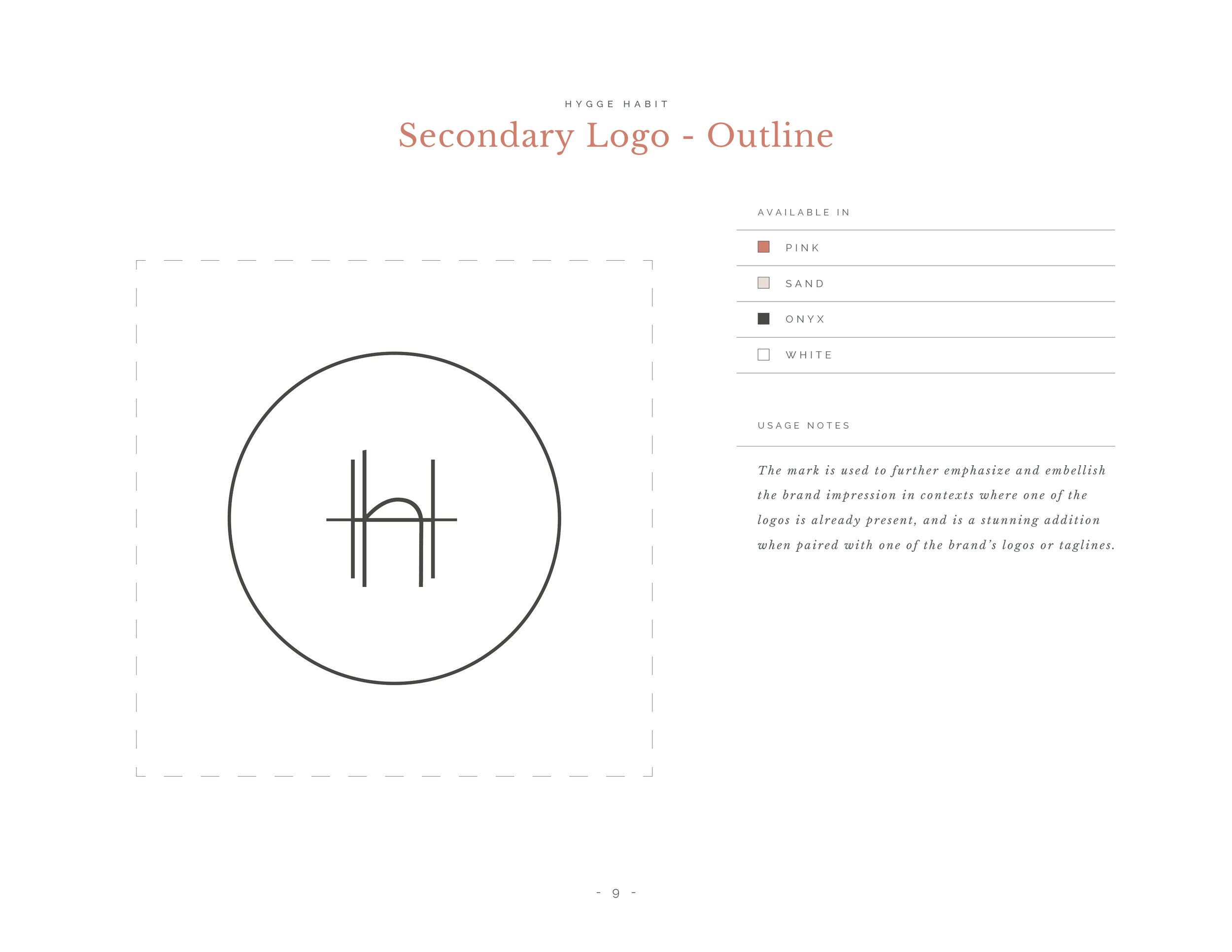
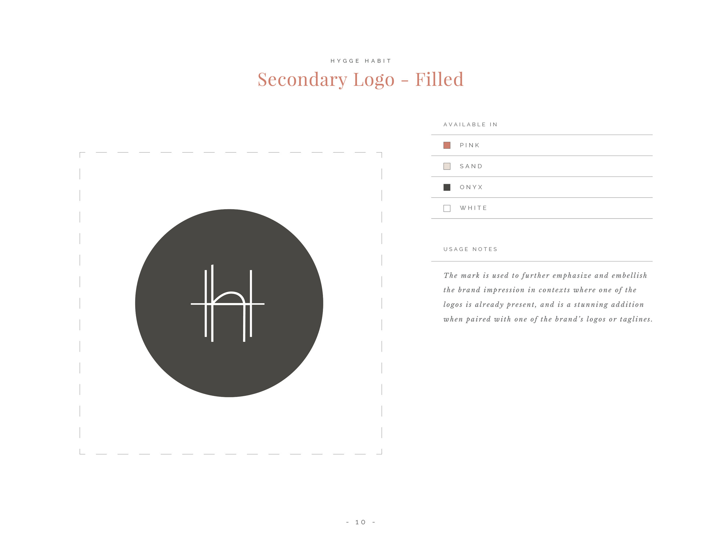
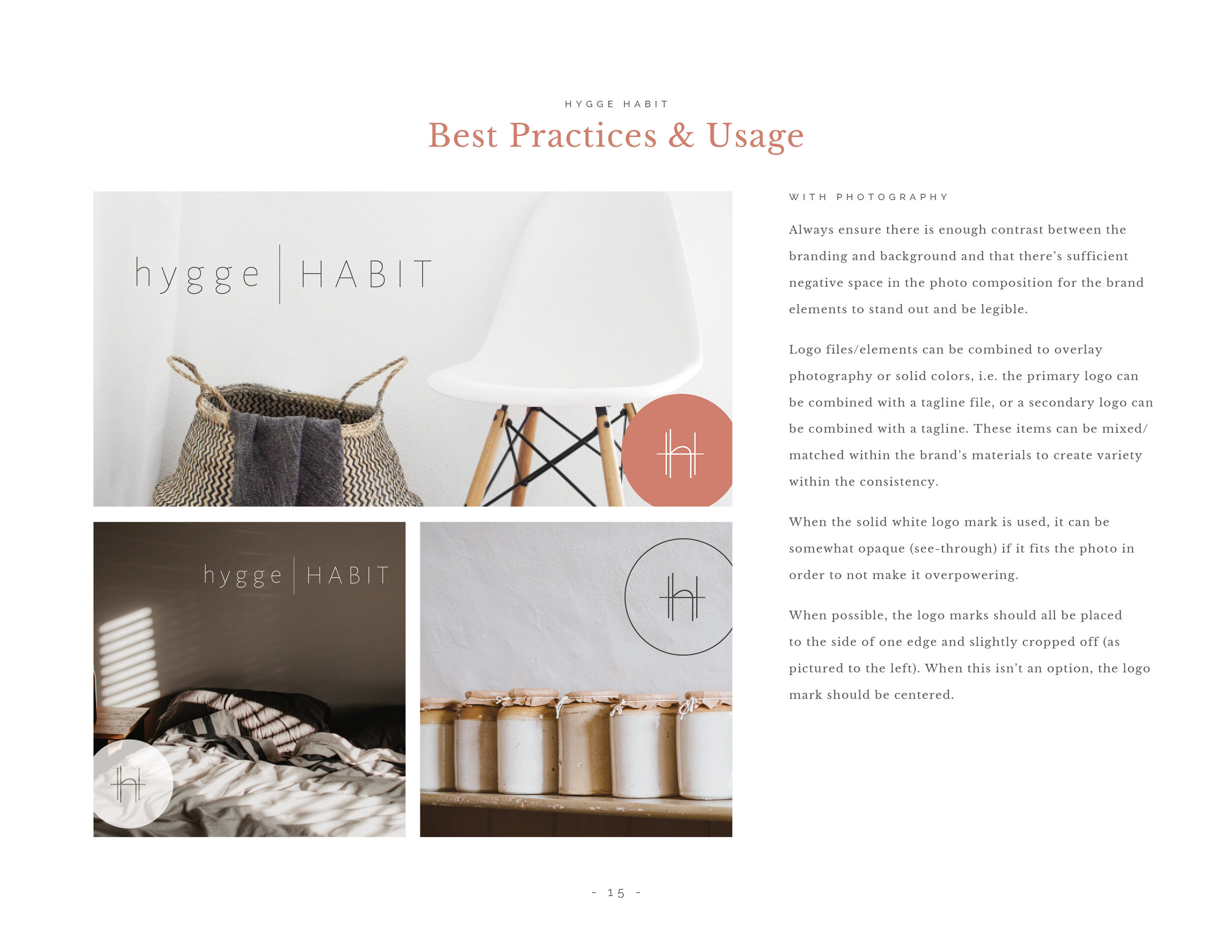
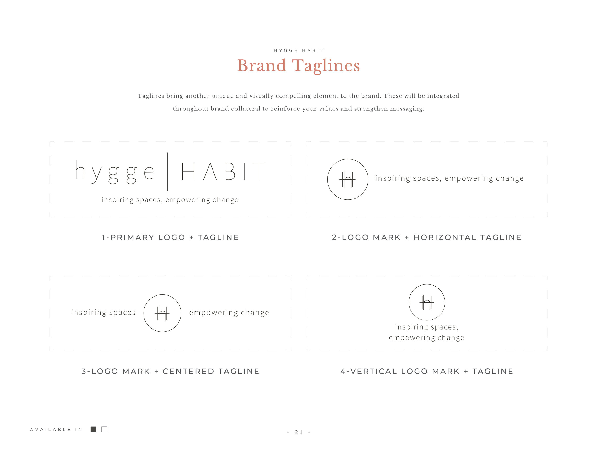
Logo Usage: Depending on the depth of the guide, you can include sizing requirements, spacing requirements, and color variation application. You can also include specifics on when secondary logos should be used.
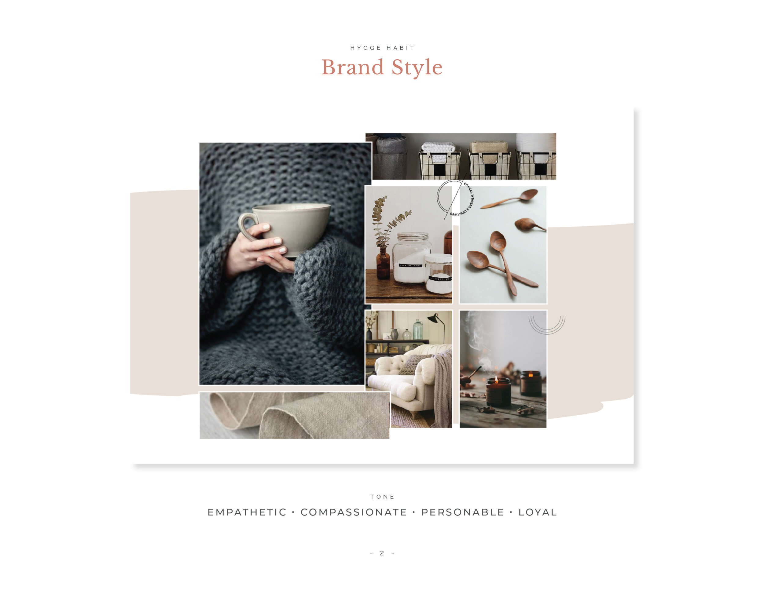
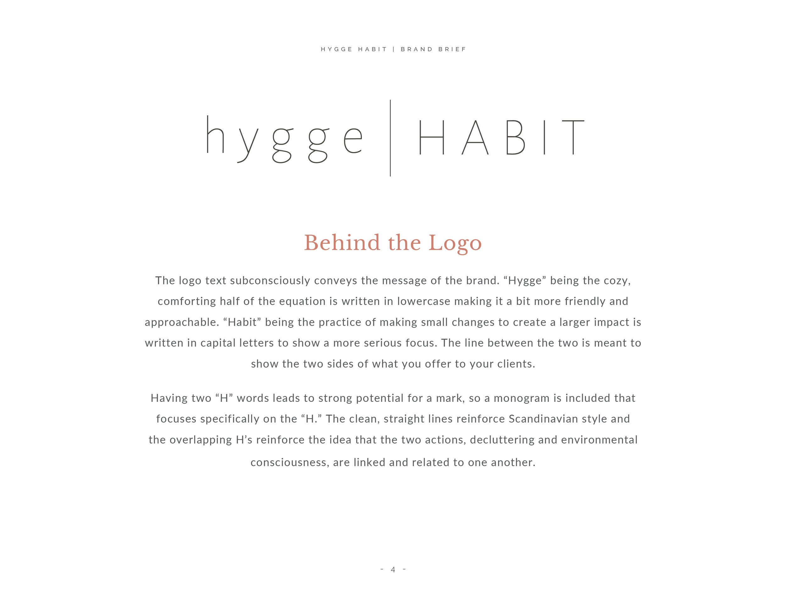
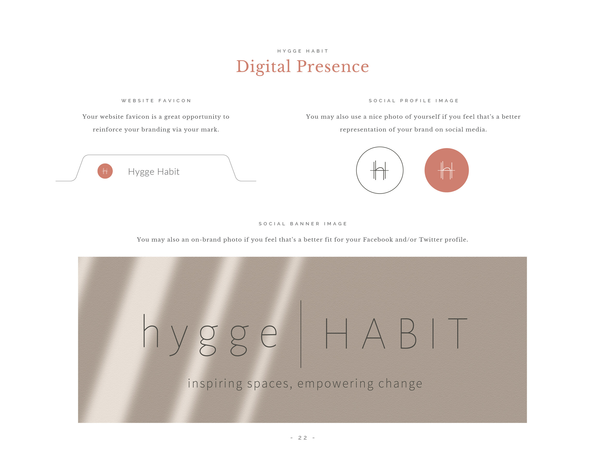
Below you can view an example of two style guides and how each is designed to reflect the company it is describing.
While the most practical application of a style guide is to outline a strong foundation for your brand that you can easily reference and share, the benefits extend far beyond that as well.
So, what are additional benefits of utilizing a style guide?
You can see your brand starting to come to life
Besides the practical application of delivering information about your brand, the brand style guide forces the idea of how your logo will be used in the future. To neglect it would be to stunt the growth of where your brand can go and how you can use each element to represent yourself in the best possible way.
Up to this point in the process, you have a logo you love and a variety of marketing materials. While this a solid start, this document not only gives your designer the chance to play with your branding elements but also to show YOU how they will come into life in future pieces, something that can be hard to convey otherwise.
Pass the baton
One of the reasons people ask to exclude a style guide from the package is because they don’t think they will use it. However, there are a lot of scenarios where an outside party will need information about your branding standards.
When I finish working with a client, the next step is often talking to a web developer, screen printer, vehicle wraps, storefront signage, etc. With a style guide they can easily access the guidelines to your brand in one quick email. Imagine how much time this saves you both! They have everything they need to get started and to stay consistent!
I can’t emphasize how important this is, yet how convenient a style guide makes this to accomplish! Maybe you are having shirts screen printed and the printer needs to know the color codes - don’t leave it up to guessing! Send them your style guide and eliminate the chance of ending up with something that is close… but not just right.
A chance to impress and share more about your company
In any of the above scenarios, there are a few ways the interaction can go.
You’ve been pulling together your branding here and there and aren’t sure how you should answer their questions.
You can relay the information they ask for by typing it and sending it in an email or explain it in a phone call.
You send them your style guide, which requires only attaching the file in an email and sending it.
So far, the descriptions above only imagine this scenario from your point of view and how easy it is on your end, but put yourself in their shoes. Imagine receiving this organized style guide that is straightforward and answers all your questions. Imagine how impressed they will be with your company! This will make a great first impression and establish your company as professional and legitimate.
Not only that, but this gives them the chance to learn something about your company, which is why I always include a brief company profile at the beginning of the document. Maybe they will read it and maybe they won’t, but it is an easy opportunity to share a little bit more about you, your company culture, and your customers.
You have to know how to follow the rules before you can break them
There is a famous quote that says something to the effect that you must learn the rules like a pro before you can break them like an artist. Having a solid foundation enables you to have the opportunity to develop and strengthen your brand recognition.
Once you get to this point, you have more freedom to expand on the basics and maybe even break the rules (did I really just say that?!) Yes! A solid groundwork keeps you from second-guessing what you should do and maintains your brand’s integrity but when you are running a special or hosting an event and want to get a little creative with the visuals, you have practiced enough to know what will still make sense for your brand and have found areas for some wiggle room within your guidelines.




Do you use a brand style guide for your business? How have you found it has helped you?


