Big Kahuna
Summary
Big Kahuna is a regional collection of ski and snowboard shops located in New Mexico. The reason for the rebrand was prompted by a change in ownership and an accompanying name change. The goal of the brand is to communicate a fun, inviting personality using a Southwestern, artsy, distinct style. It should work well for a variety of audiences including families, vacationers, athletically geared, and those who casually enjoy outdoor sports.
**The taglines are placeholder info and can be updated in revision rounds.
Below each of the three concepts shows the
Primary, Horizontal Logo
Vertical Logo
Monogram Mark
Horizontal Extended Logo
Business Card Mockup
Photo Overlays
Logo Suite
Note
While each of these designs are meant to show a developed idea of each concept, each will be refined and the chosen concept will be carefully considered and added to until the brand is the strongest representation it can be.
Business card concepts and the homepage mockup are meant to show how the brand can progress beyond the logo alone and will be refined along with the logo. Additionally, the information shown is placeholder information.
Moodboard

Initial Concepts

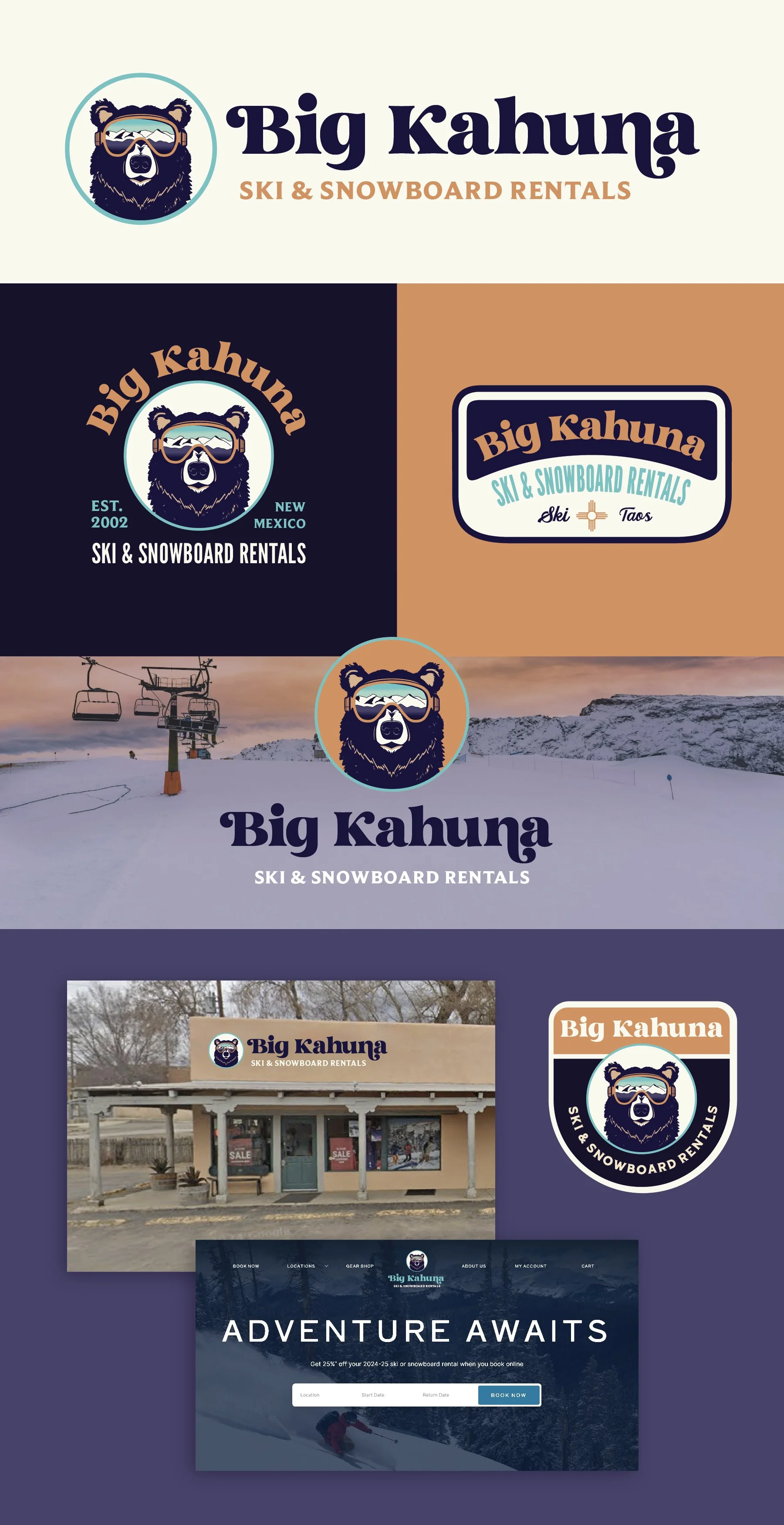
Concept 1 - Cool, athletic, distinct
Strong suits: Circles are versatile and easy to use in branding. It can easily be incorporated into other compositions for a more layered look like the examples below or can easily be used on its own. You can also easily change the color of the circle background so it always reads as a black bear even on a dark background.
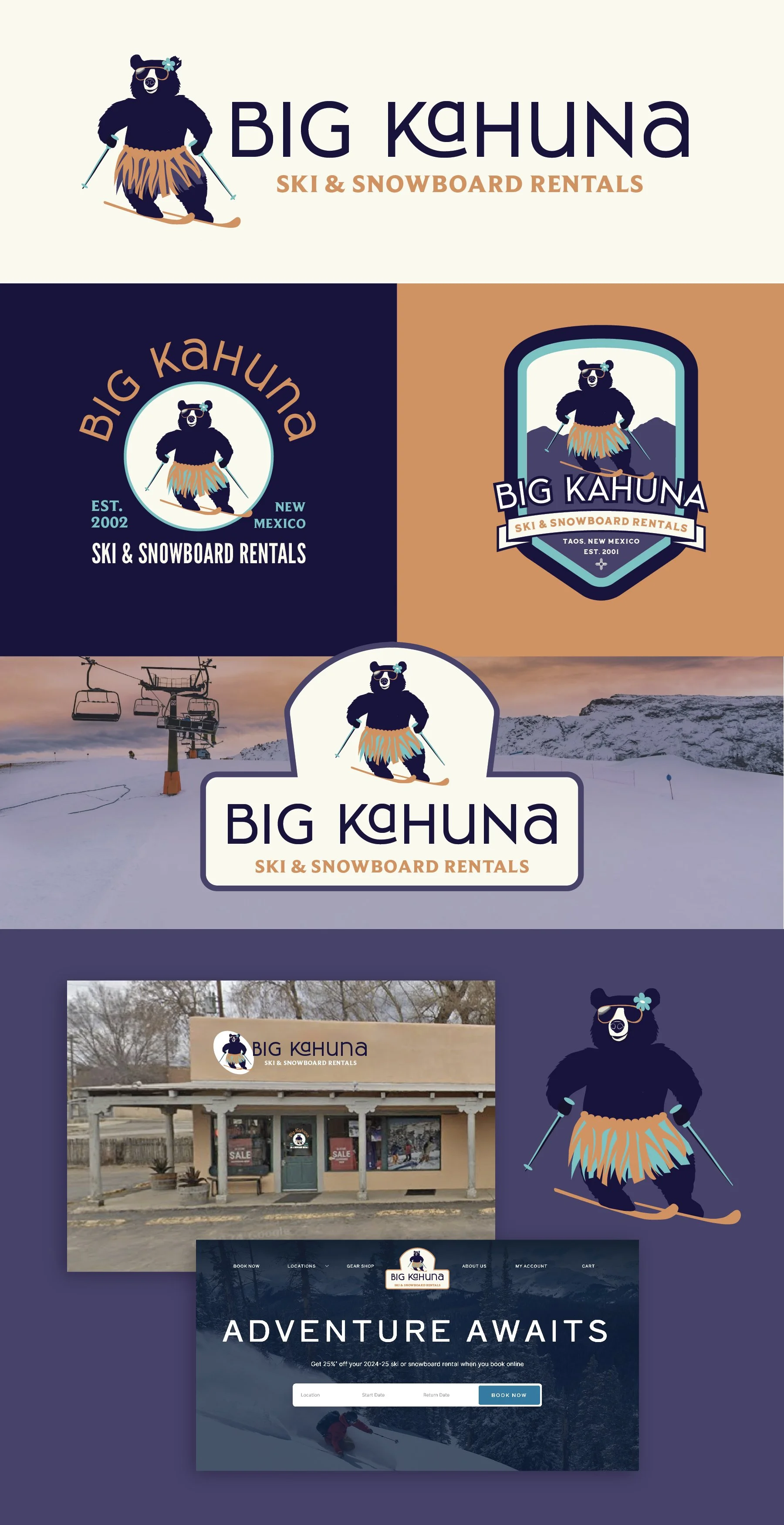
Concept 2 - Playful, distinct, personable
This has a LOT of personality. It will be really distinct in the outdoor athletics space and set you apart as fun and inviting while still feeling modern. One primary goal of this one was to be fun without crossing over into feeling juvenile or cartoony. This one certainly draws on Maui, the Rock’s character in Moana - lovable, goofy, cool, nonchalant, fun.
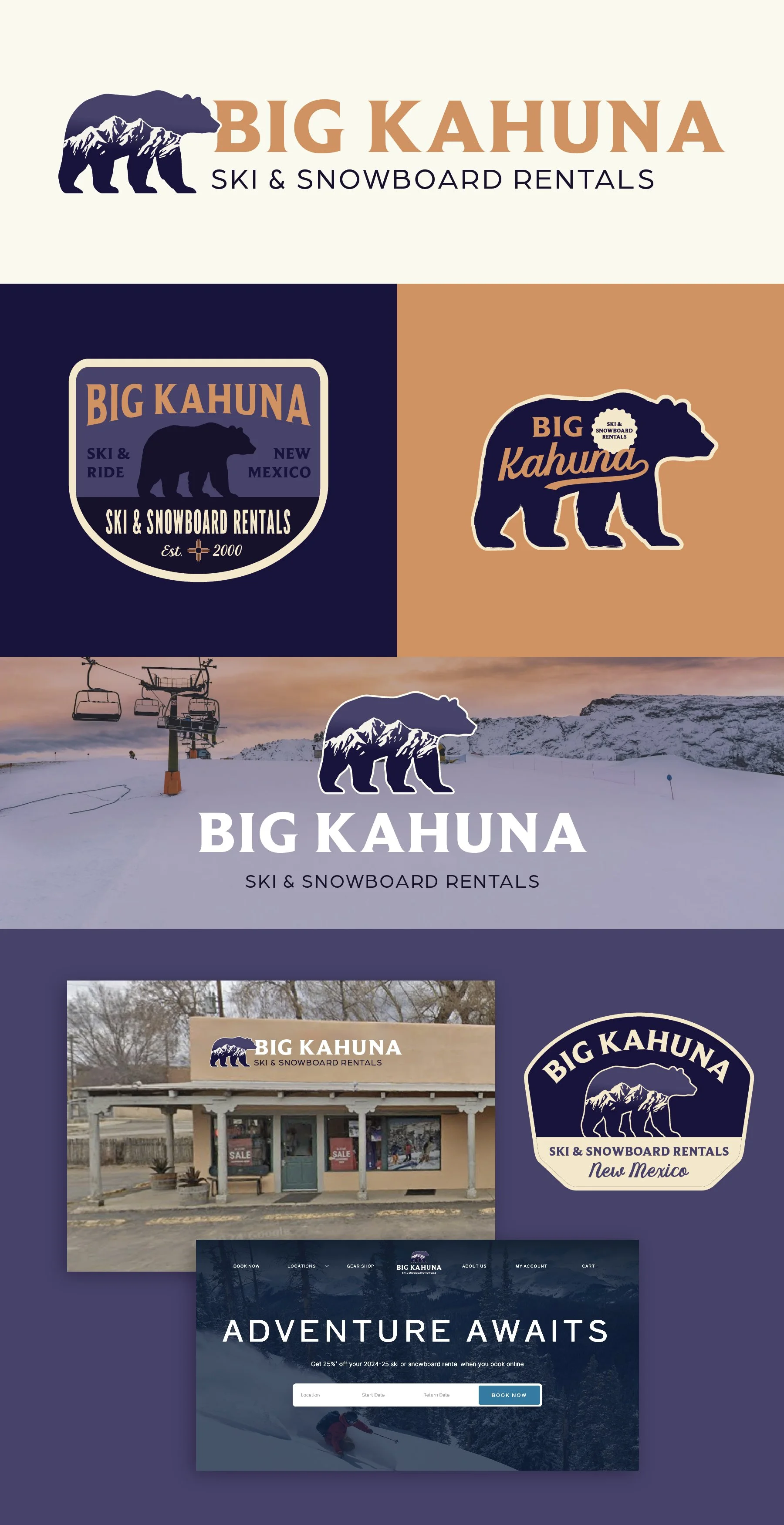
Concept 3 - Simple, versatile, classic
This concept provides a total counterpoint to the above options. It’s a more “classic” take on a mountain region brand. It will appeal to a broad audience and has versatile usage applications. The mountain detail can be included most of the time for a more distinct logo, but can be removed when you want a more minimal, simplistic look for apparel, to replace with text, etc.