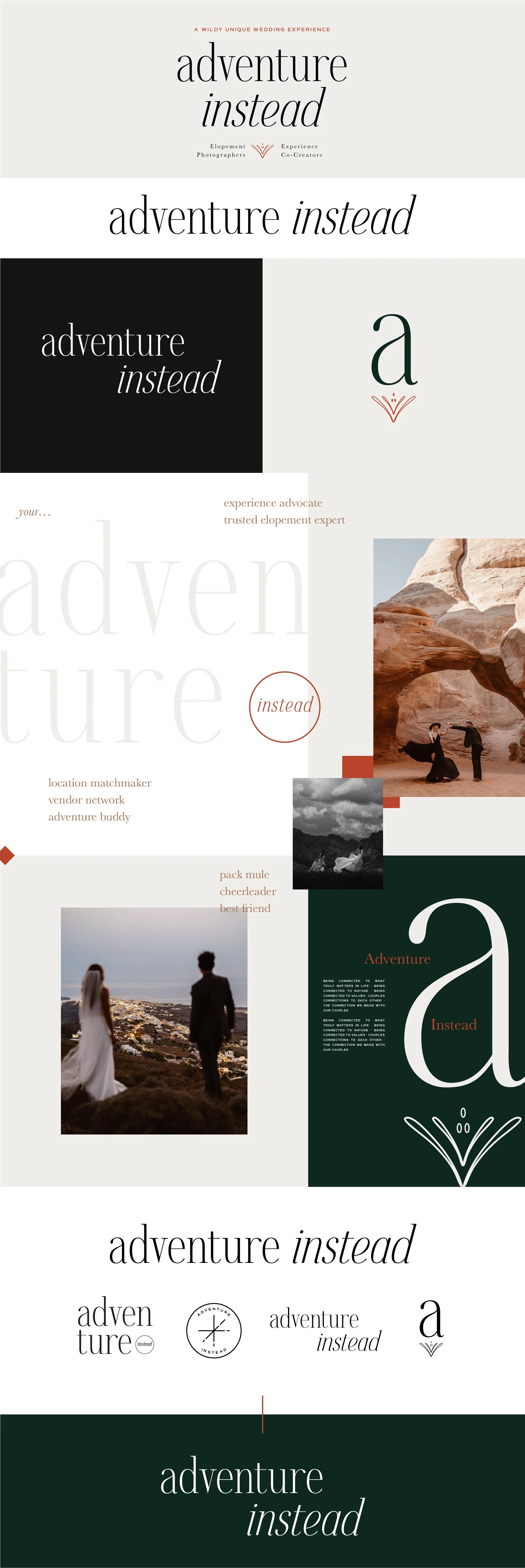
Adventure Instead
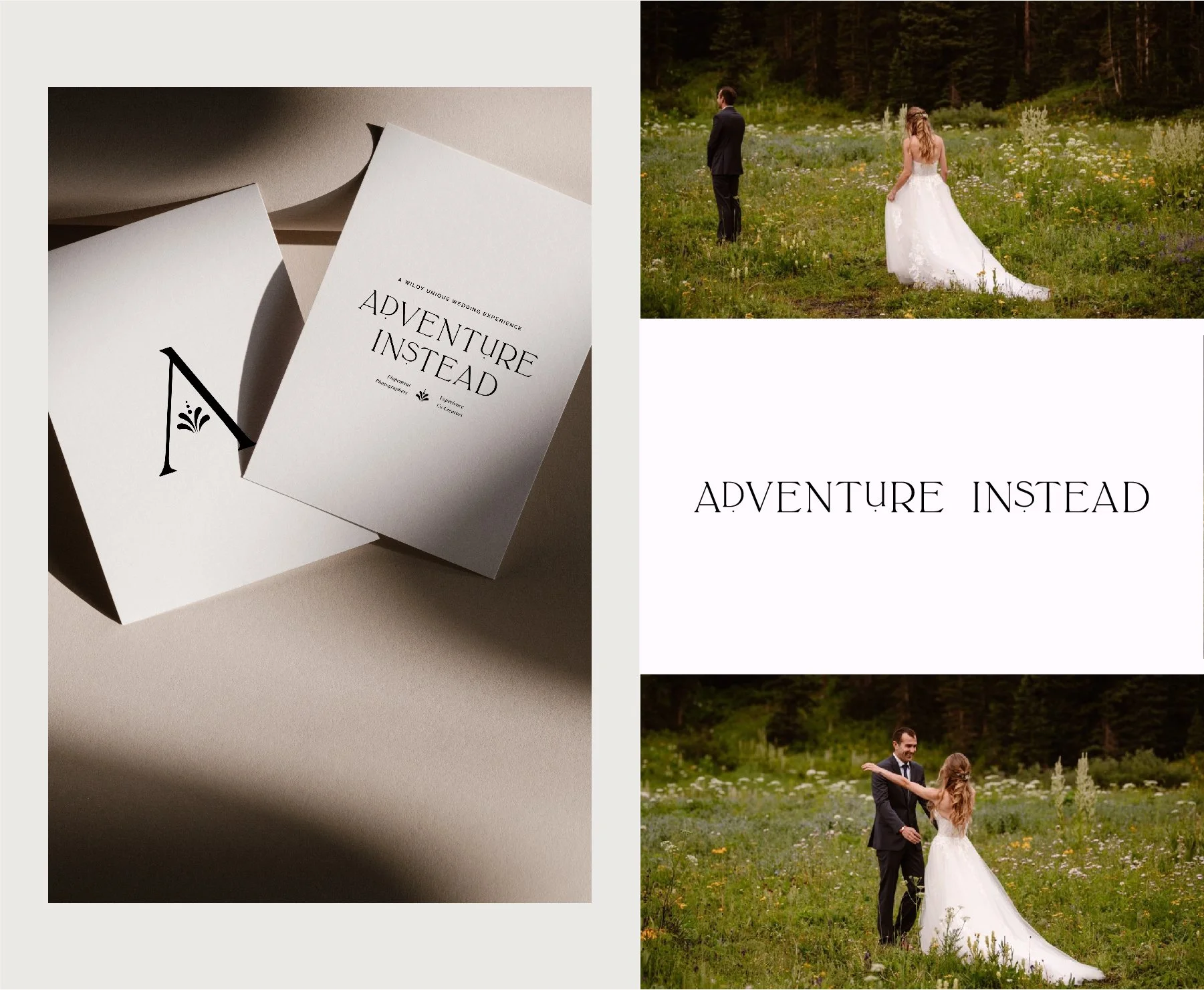
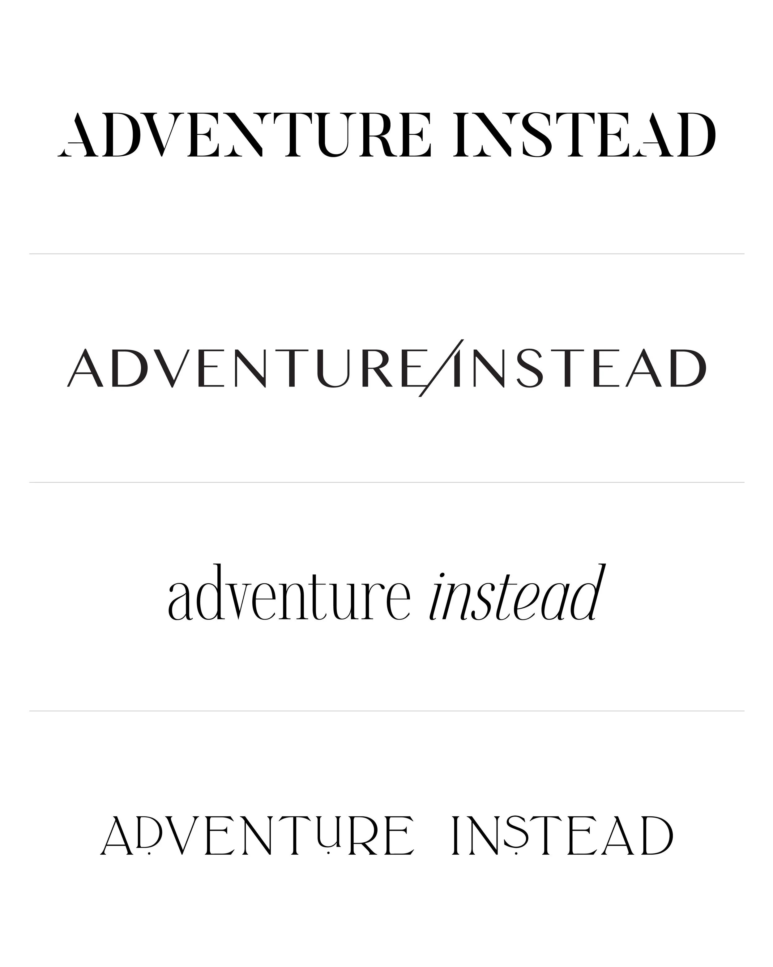
Below each of the three concepts shows the
Primary Horizontal Logo
Vertical Tagline Logo
Initial Logo Mark
Logo Variations
Pull Quote Example
**Beginning Color Palette
Note
While each of these designs are meant to show a developed idea of each concept, each will be refined and the chosen concept will be carefully considered and added to until the brand is the strongest representation it can be.
The Adventure Instead brand has so many applications, that regardless of the concept chosen it will evolve and have elements added as new needs arise.
Particularly, the color palette is meant to show a general direction and starting point and will be added to/refined within the first few marketing items.
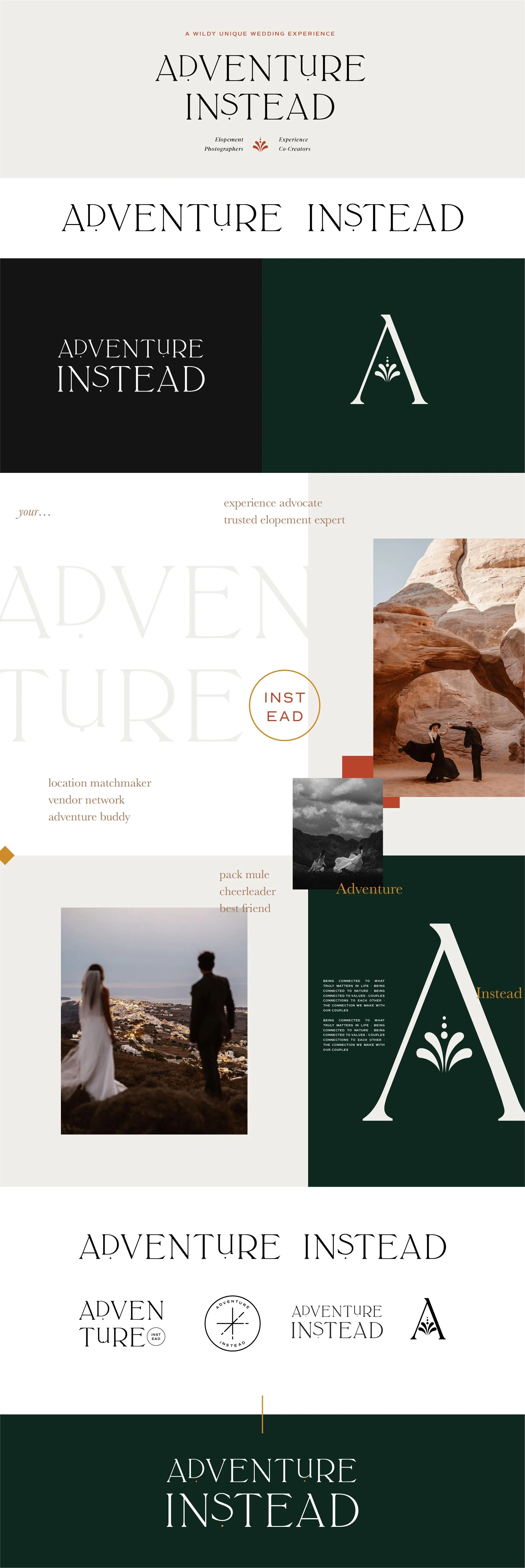
Moodboard & Logo Concepts
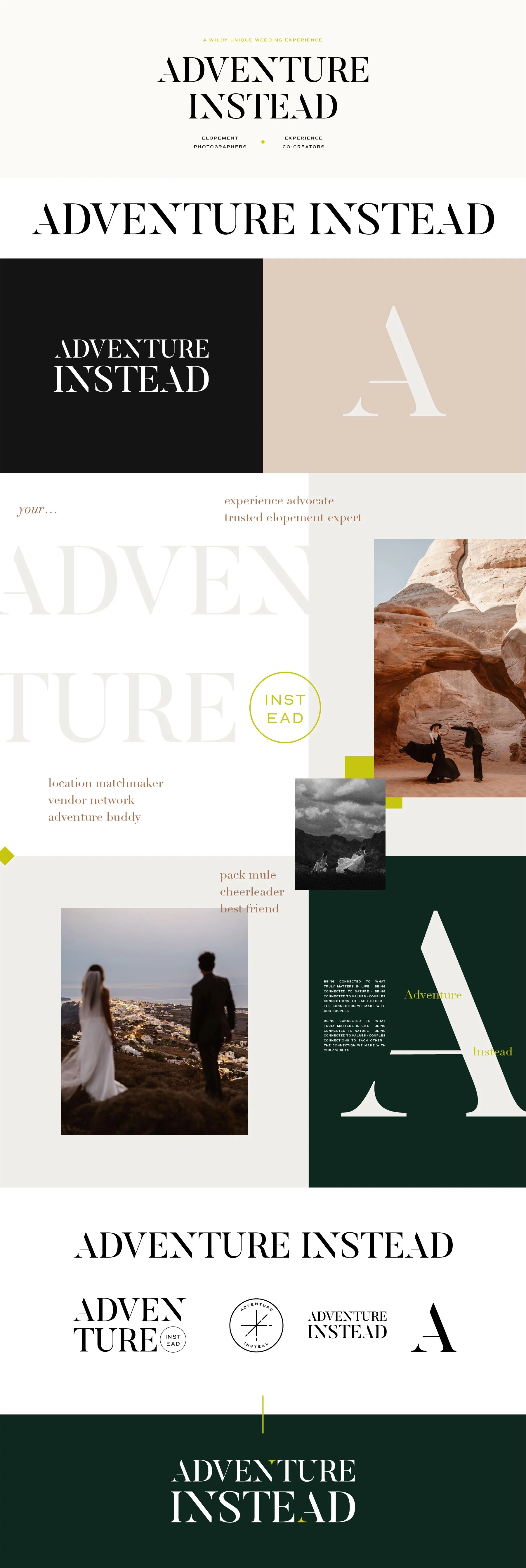
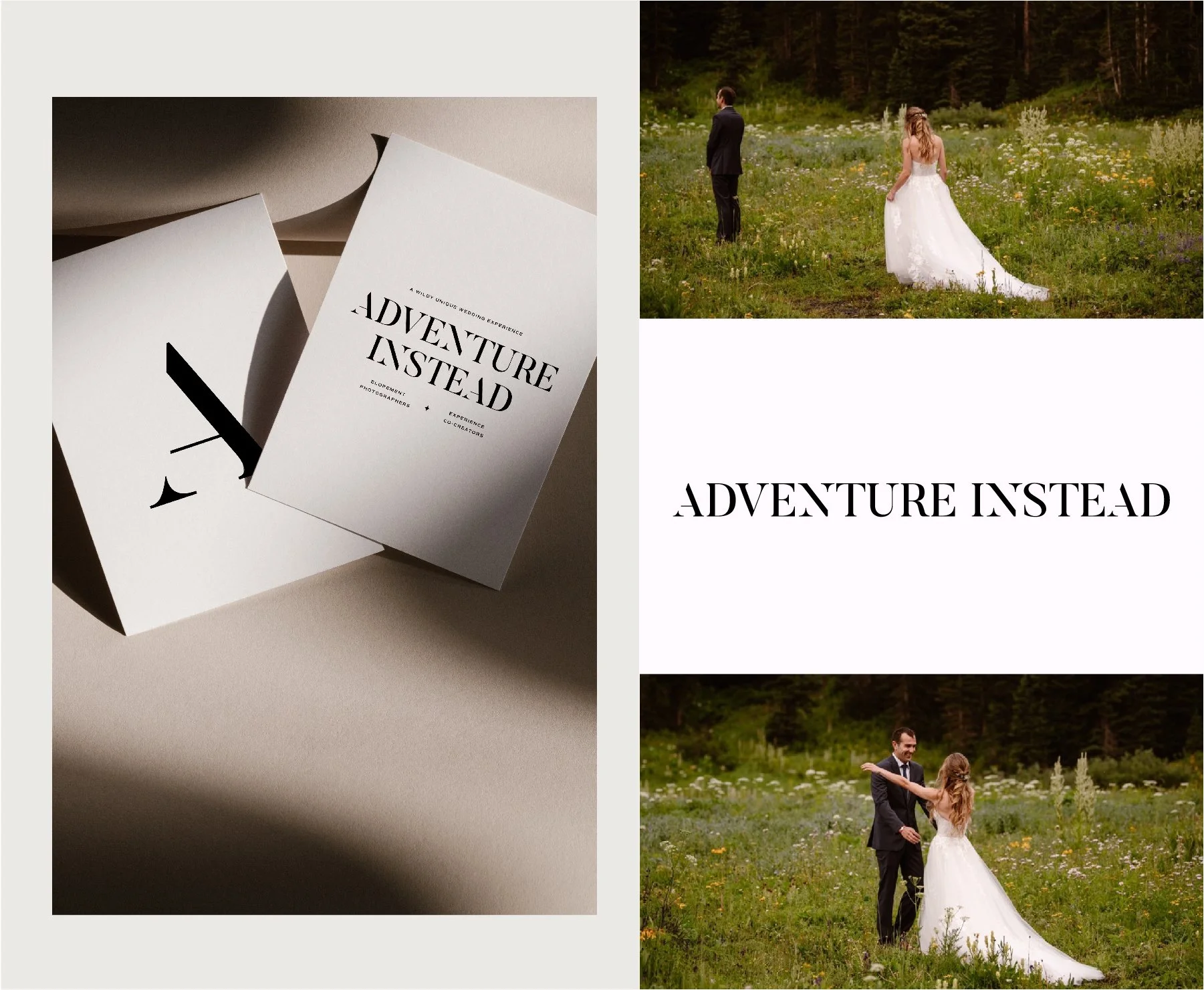
Concept 1
Key descriptor words: Bold, editorial, chic, timeless
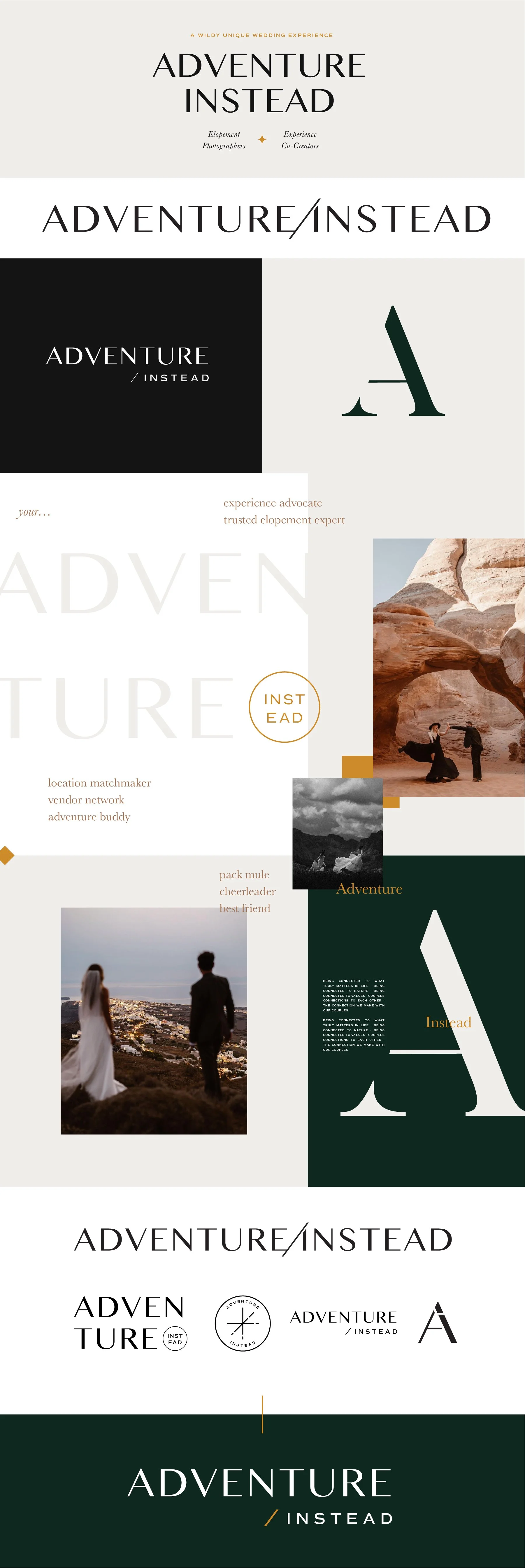
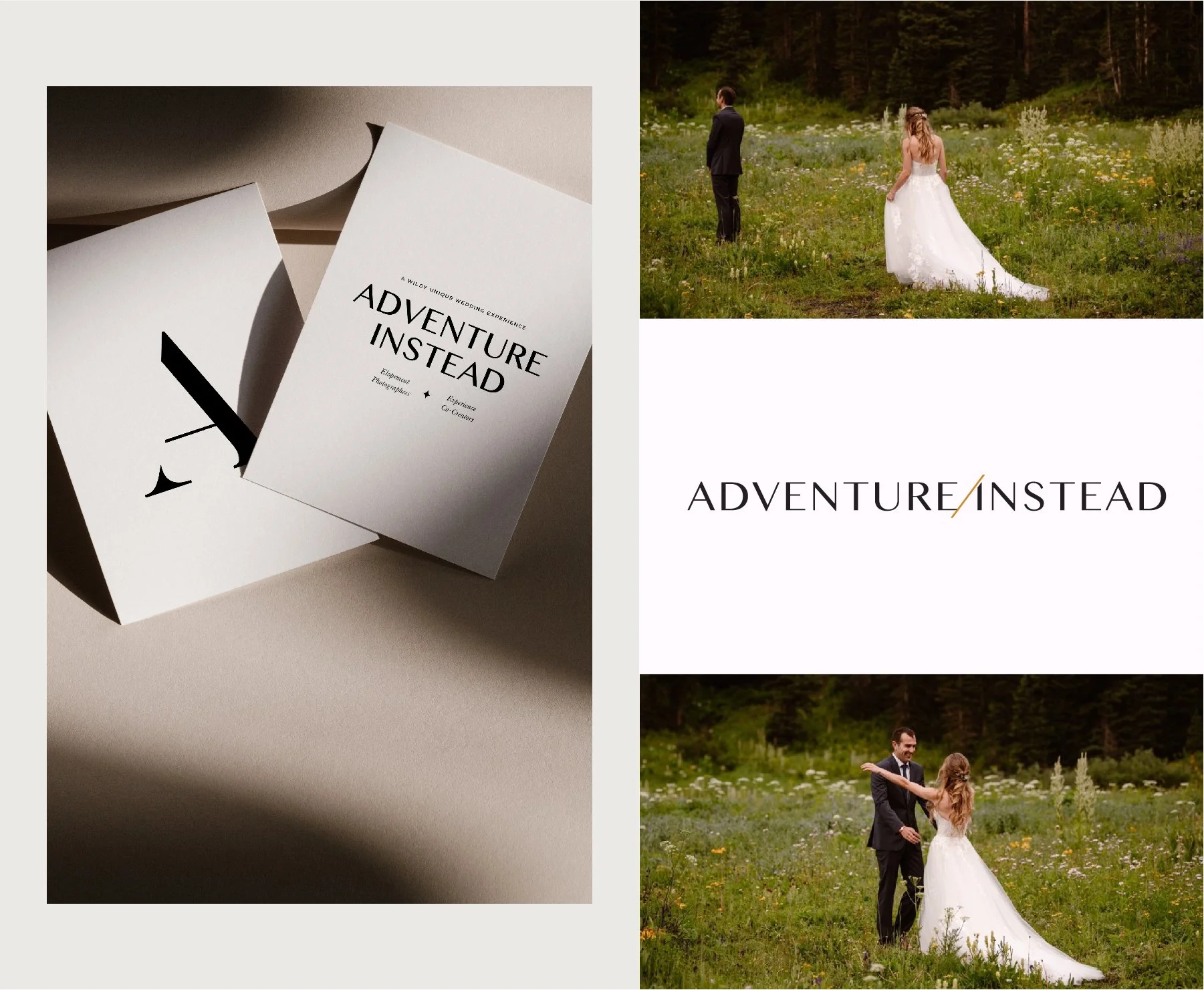
Concept 2
Key descriptor words: Clean, modern, approachable, luxe, calming
Concept 3
Key descriptor words: airy, romantic, light, classic
Travel magazine vibes. Has quiet confidence. A timeless, delicate editorial. Really modern, romantic take on a traditional serif. Has some art deco elements incorporated - could go further with this or could become more minimal.

Concept 4
Key descriptor words: quirky, noticeable
Has more of a head turning quality because of the elements of customization in the type. Has a lot of opportunities for fun quirky details in the branding.